Content Sections
This area of documentation provides information on the different sections that can be added to groups.
To add a section, hover over an exisiting group and click the Plus button labeled Add Section.
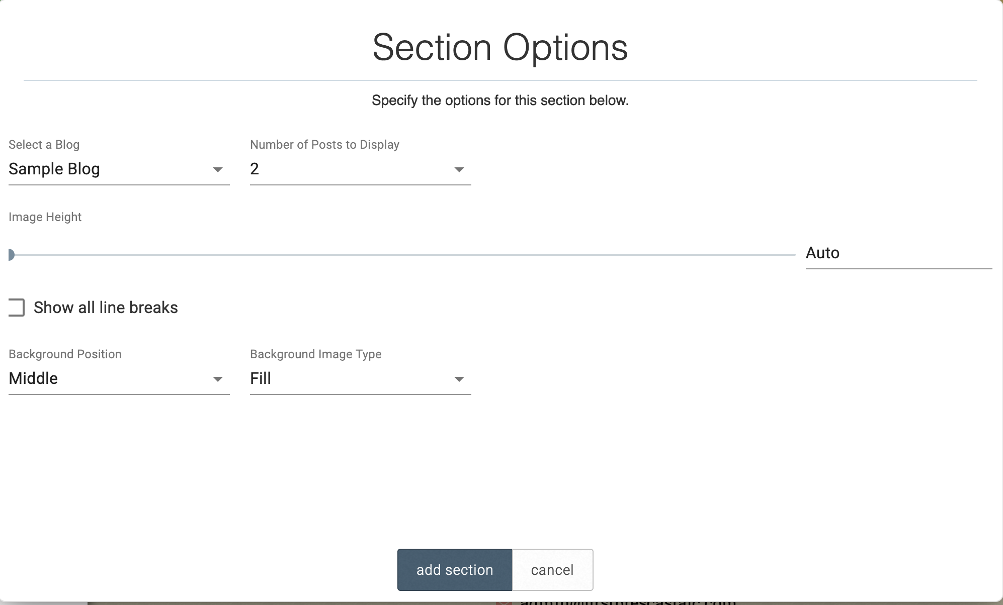
- Select the Blog Preview section type
- Select the desired layout
- You can either select an already existing blog
- Add posts to your blog, click Add Post in the edit menu
- Go to google.com/calendar. You will need to either sign into an existing google account or create a new one.
- To share the calendar, navigate to the gear icon in the top right corner and then click Settings.
- On the left, select the calendar you would like to sync to your website.
- Once you have selected the calendar, make the checkbox labeled “Make available to public” is marked and that the dropdown to the right shows “See all event details.”
- Next, scroll down to the Integrate Calendar section and locate your Calendar ID, highlight it and copy it.
- There a multiple options to begin creating a form: a. If creating a form from a template, select the template you would like to create the form from, then enter a name for your form, then press “Save Form” before clicking “Add Section” b. You can copy an existing form on your site. This is a good option for forms that are very similar but require small edits.
- Once your form has been added, you can edit the fields by clicking on the form section
- After clicking on your form, a left panel will slide in with an option for Form Settings and various field types will be visible. In form settings you can change the title, payment processor, submission email, and confirmation message.
- To add a new field, click the desired field from the field list on the left hand side.
- Double-click on an existing field to alter its settings. Form Settings
- The first is to redirect the user to a particular webpage, which can be specified in the “Confirmation Page URL” area.
- The second is to have a Confirmation Message appear on the screen upon completing the form. For more information on editing text in the Confirmation Message, see the Plain Text.
- If you have a URL to an image, you can select “URL” and paste the link.
- If you have a file, keep “Local” selected.
- The Local option: choose a photo from your device to upload onto the site.
- The Server option ––> choose an image that has already been uploaded to the site.
- The Stock ––> choose an image from a library of free stock images. Once the image is added, use the “Arrange Sections” tool to change how large the image is.
- Block and Small Block Layout
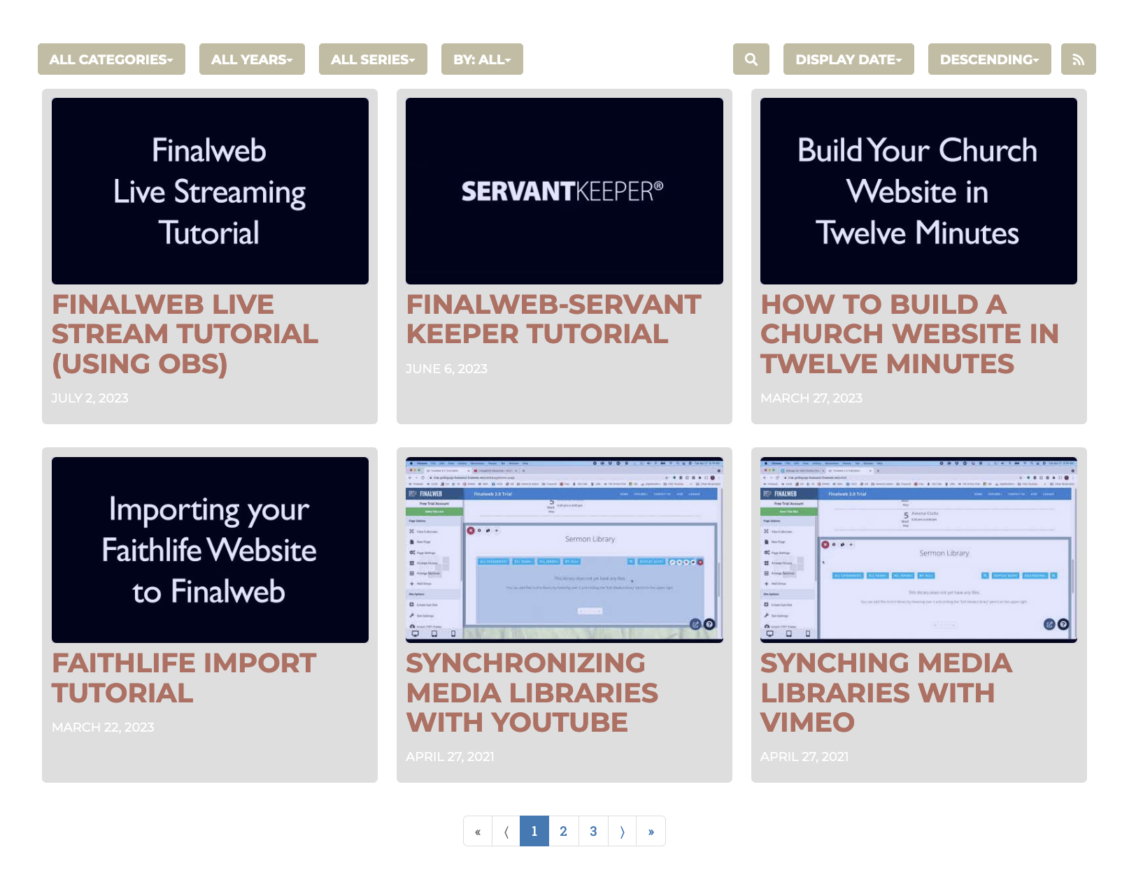
-
List Layout
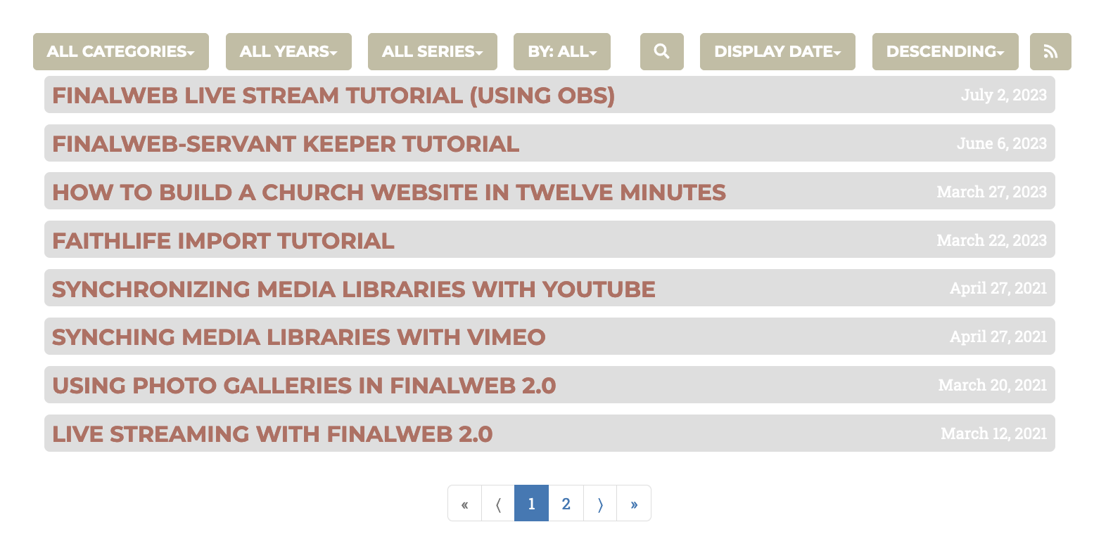
-
Series Layout
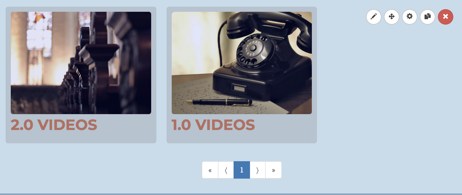
-
Horizantal Layout

-
Player Layout
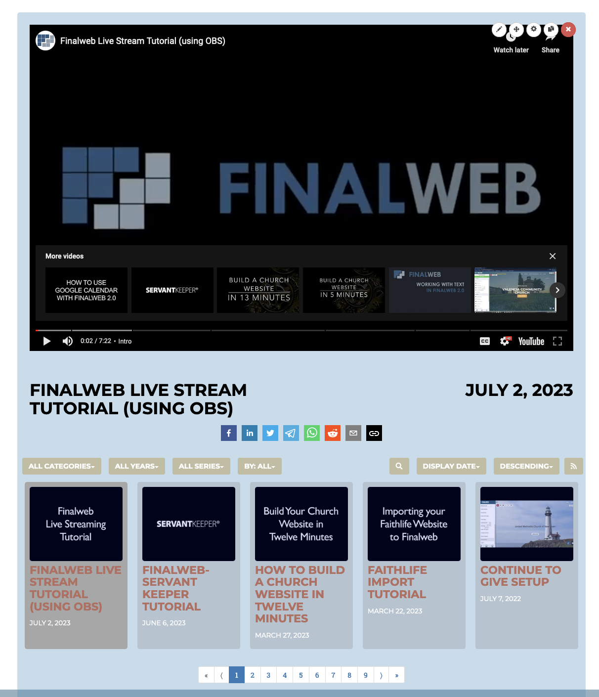
-
Carousel Layout

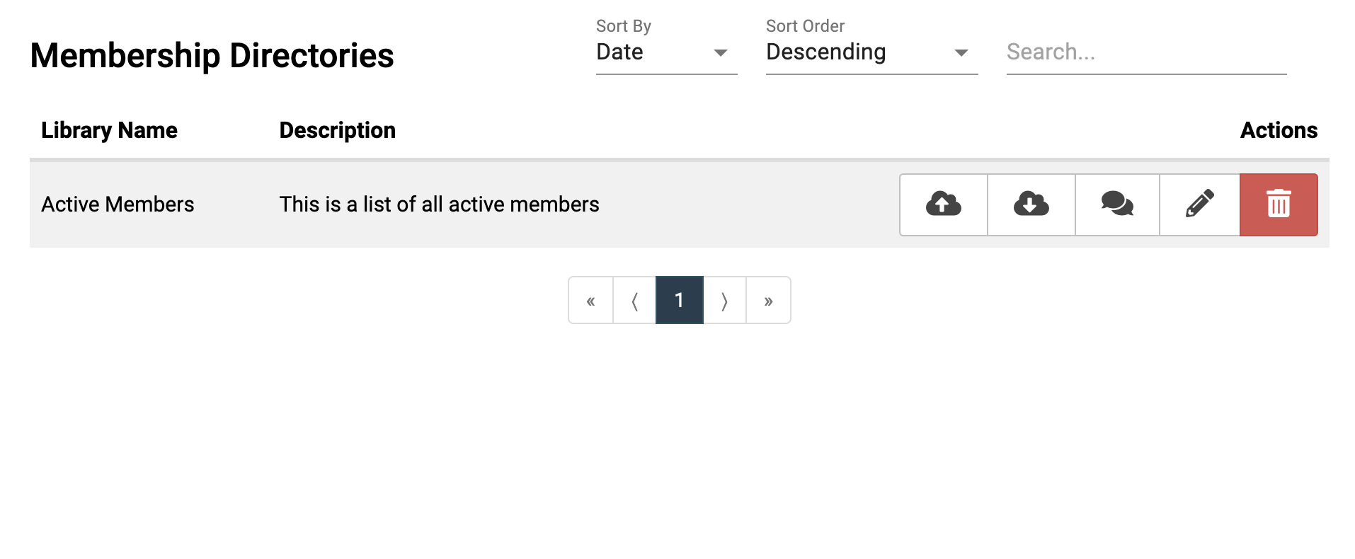
- Go to Administration and find the Membership Directories tab
- Create a new directory by clicking the Plus button.
- Give a name and brief description for your directory.
- ‘Cloud + Up arrow’ = uploading members through an existing .csv file.
- ‘Cloud + Down arrow’ = downloading members from the website
- Two quote bubbles = Send out a mass text or email to members of directory.
- Pencil = Adding, editing, and deleting members.
- You must create a family, then members within families.
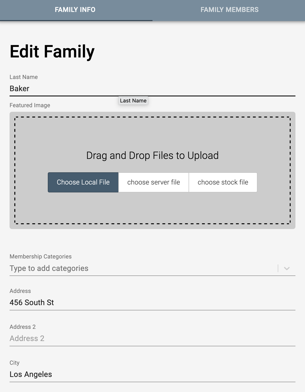
- Input a Last Name and basic contact information.
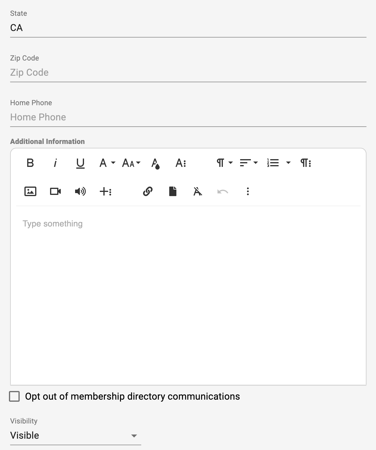
- At the bottom, you can add additional information about the family, mark if they opt out of directory communications, or whether the family is visible to other users in the directory
- After creating a family, you can add individual members into each family.
- Click on a family, and you will see a new “Family Members” tab at the top. Here you can add individuals within each family.
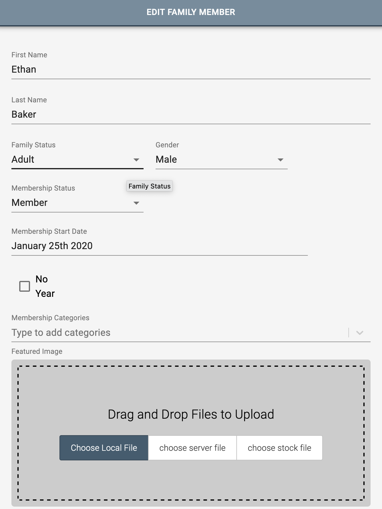
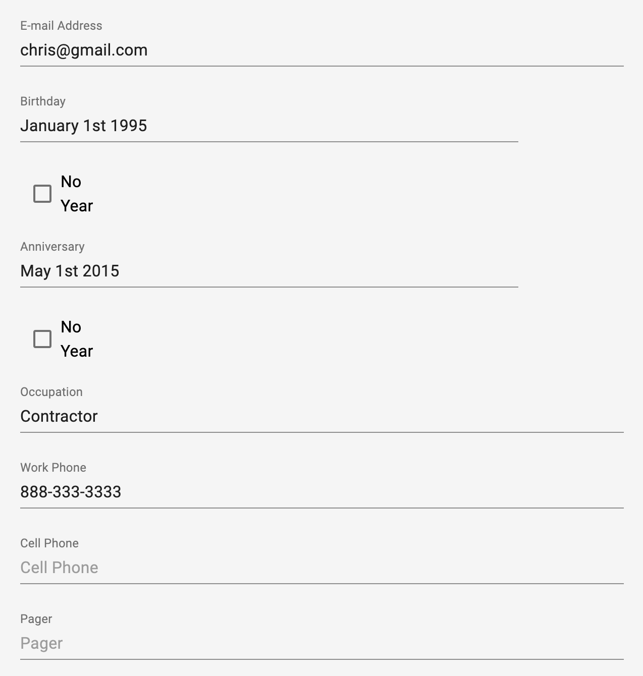
- For each member, there is a variety of fields regarding membership information, personal information and contact, and any notes for that member.
- Select the Upcoming Events section type
- Set the display options and choose one or more Google calendars to pull events from. All these settings can be modified later in the Section Properties
Add a text box to your group.
After adding the section, you can click inside the box to modify it and replace it with your own. After highlighting the text, you can change fonts, colors, add images, links, buttons, etc. by selecting the appropriate options in the text editor menu that appears.
Upon clicking Section Properties in the upper right corner, you can make changes to the text box background (color, image, texture, opacity).In this menu you can also add shadows and animations to your text.
This section causes an existing form to appear on screen that the user has to fill out before continuing onto the page. Click “Edit Agreement” to modify the title of the agreement and the text the precedes the form.
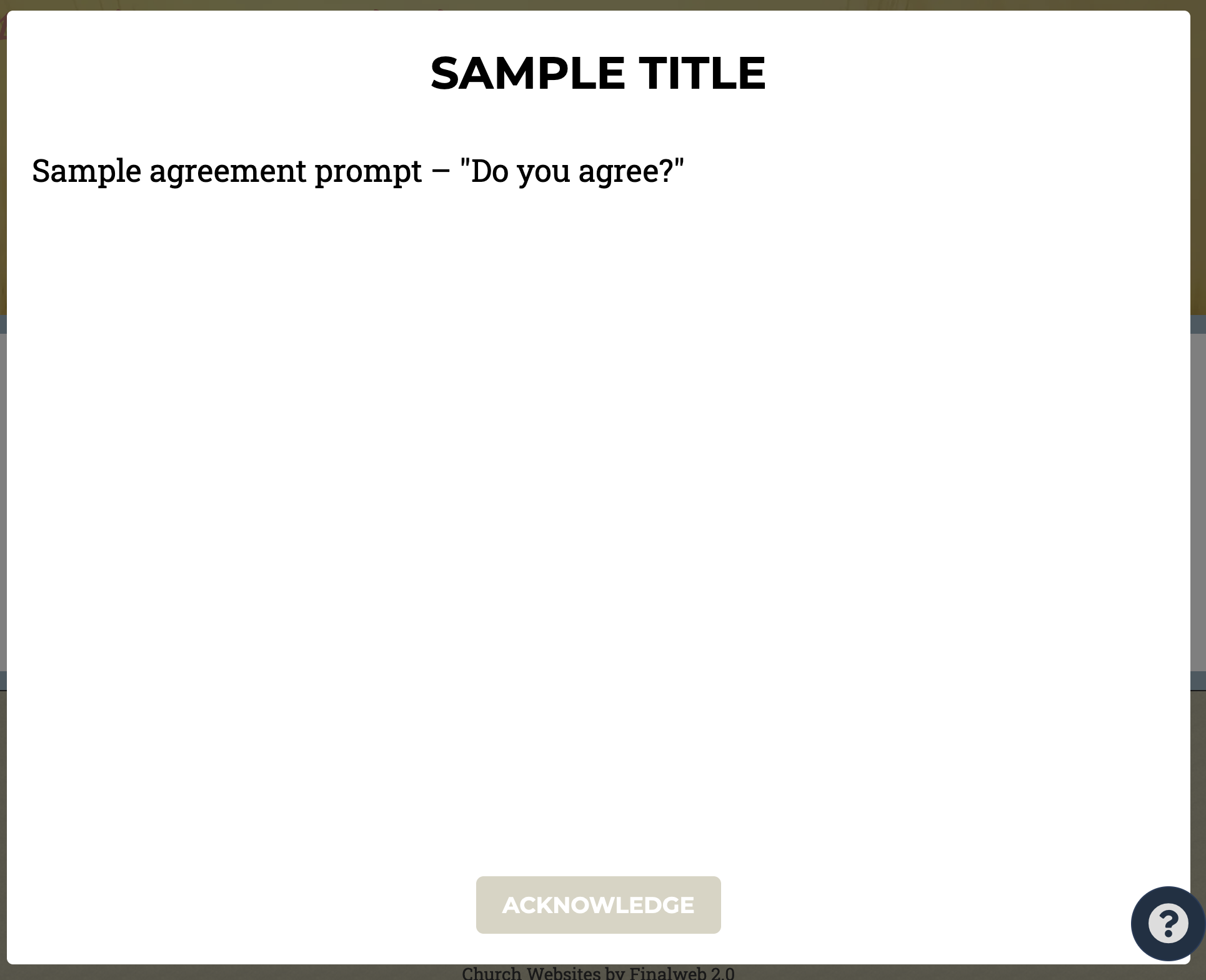
In “Section Properties,” you can select a form to be presented to the user.
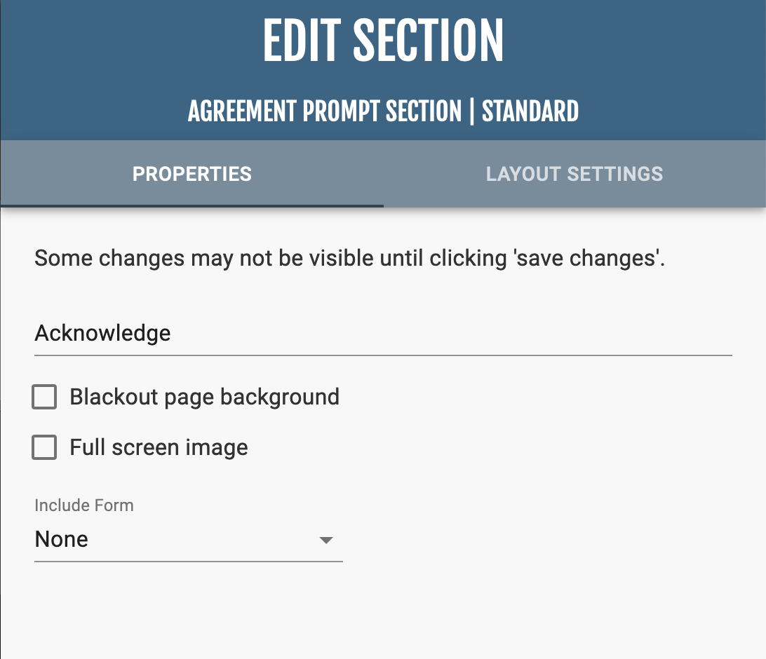
Place a singular Audio file onto a webpage.

You can choose either a local file or a file that already exists on the website (i.e. a server file). There is also an option to select AutoPlay.
Blog Settings
Unlike most sections, the Blog Settings are not found under the Section Properties, but rather on the edit menu on the left hand side. From here you can either manage the Blog Settings or create a new post.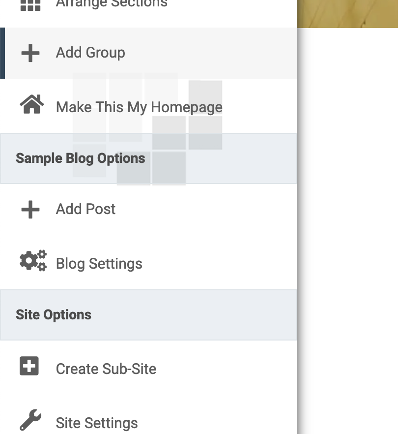
In the Blog Settings, there are a series of checkboxes to control who can comment on blog posts, displaying author / editor names, publish dates, and other display features. Below these are options to supply an email address where you can be reached, and who can subscribe to the blog.
Create a Post
Click "Add Post" in the edit menu on the left hand side. When you create a blog post, you will first supply a title, author, and an optional featured image.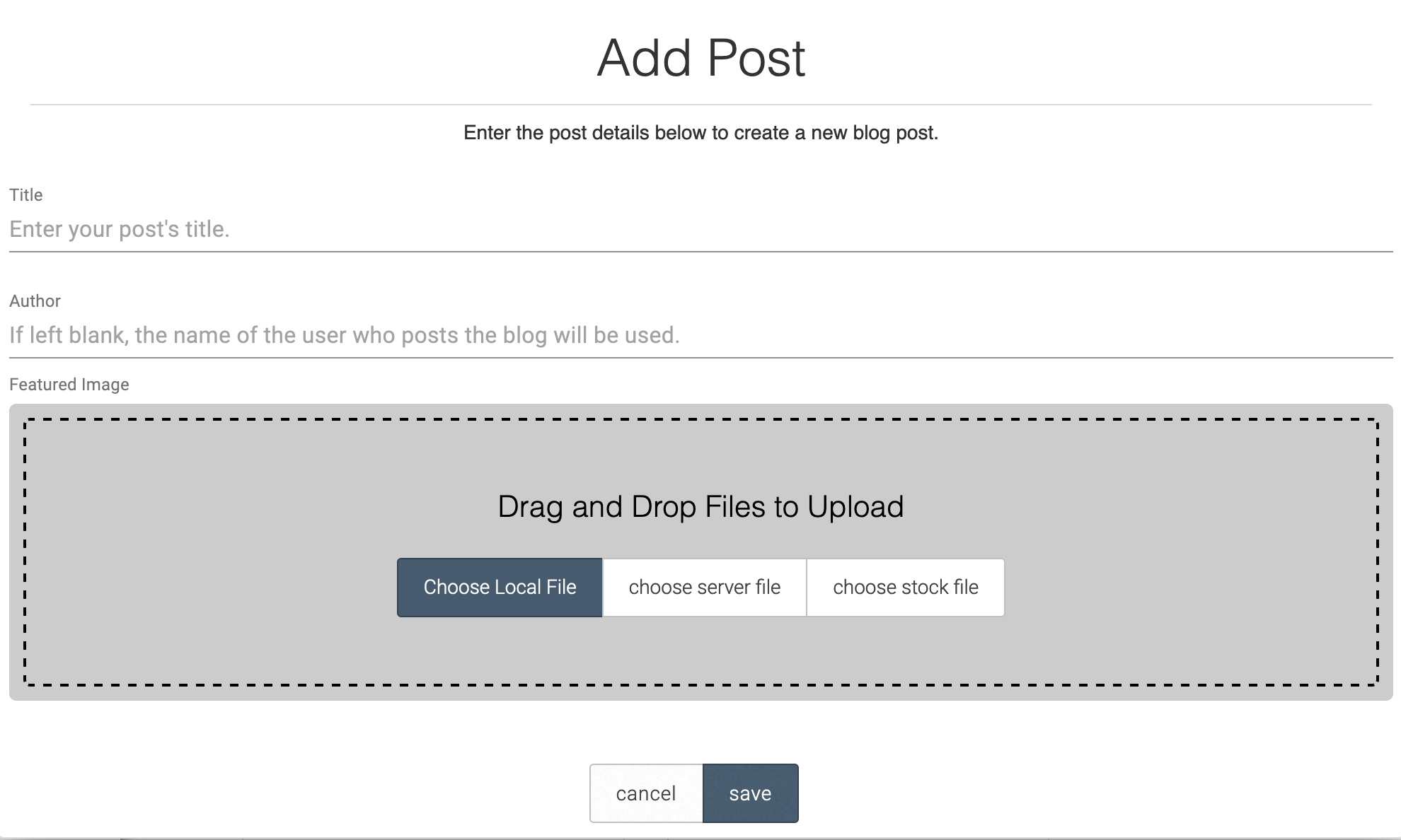
Editing Post Content
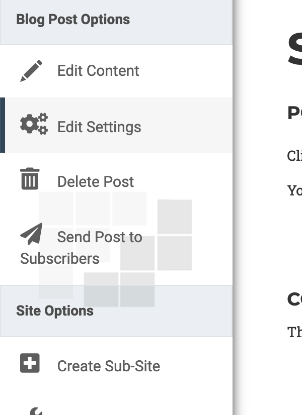
To edit the contents of a post, click “Edit Content.”To manage settings such as post date’s, images, thumbnails, tags, comment allowance, or hiding the post, click “Edit Settings.”
Click the “Send Post to Subscribers” in the Edit Menu when working on a Blog Post to send an email notification to your subscribers.
Creating the Field
This section adds a month-view calendar that is connected to an existing Google Calendar.
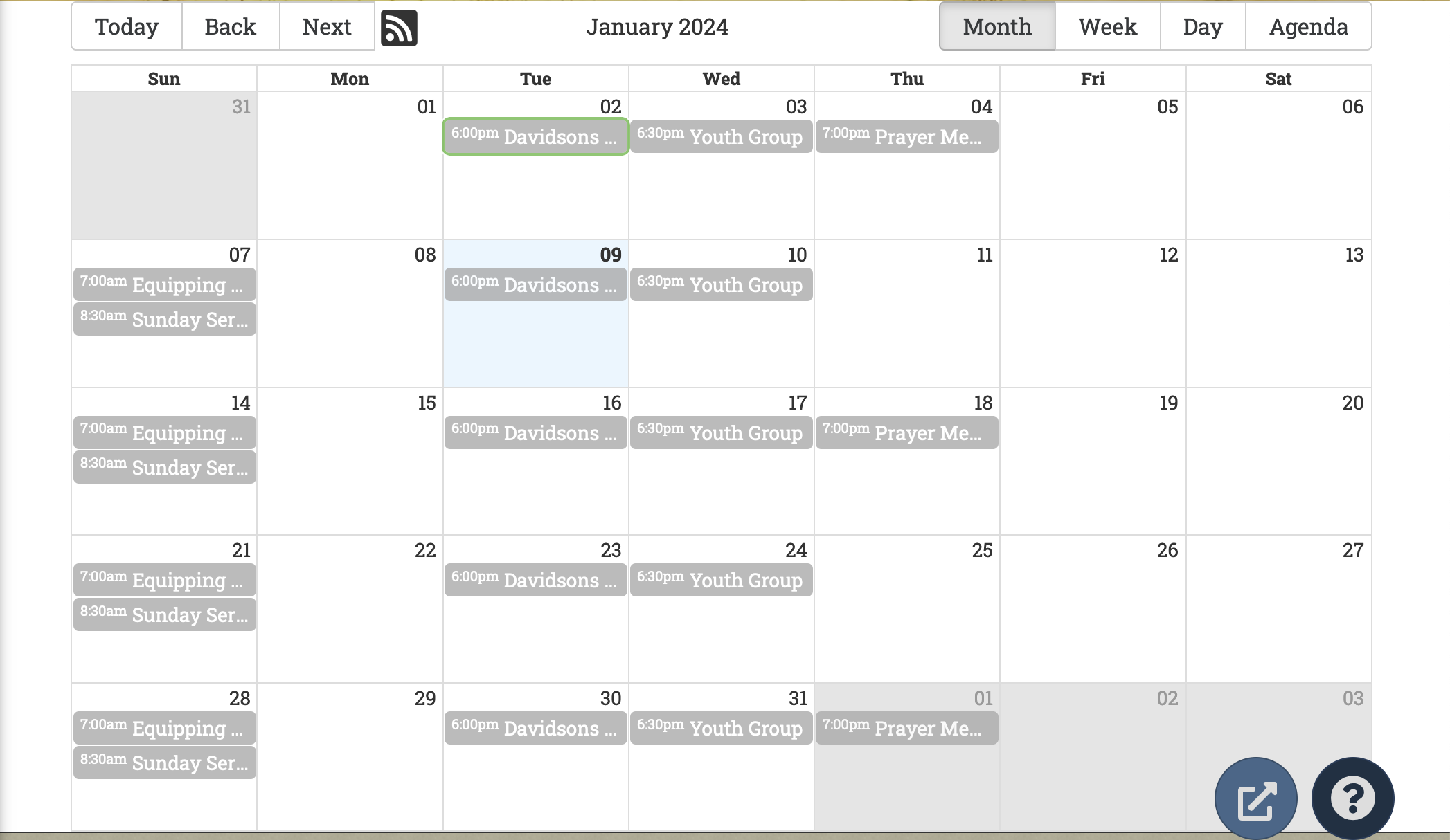
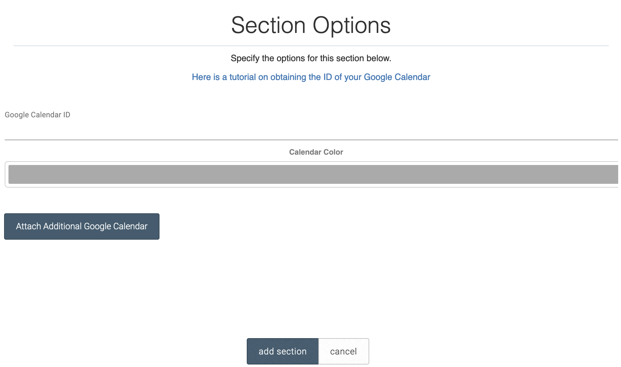
When you add the Calendar section, you will be prompted to enter your google Calendar ID. To obtain your Calendar ID, do the following:
Return to the Calendar section, and enter the Calendar ID.
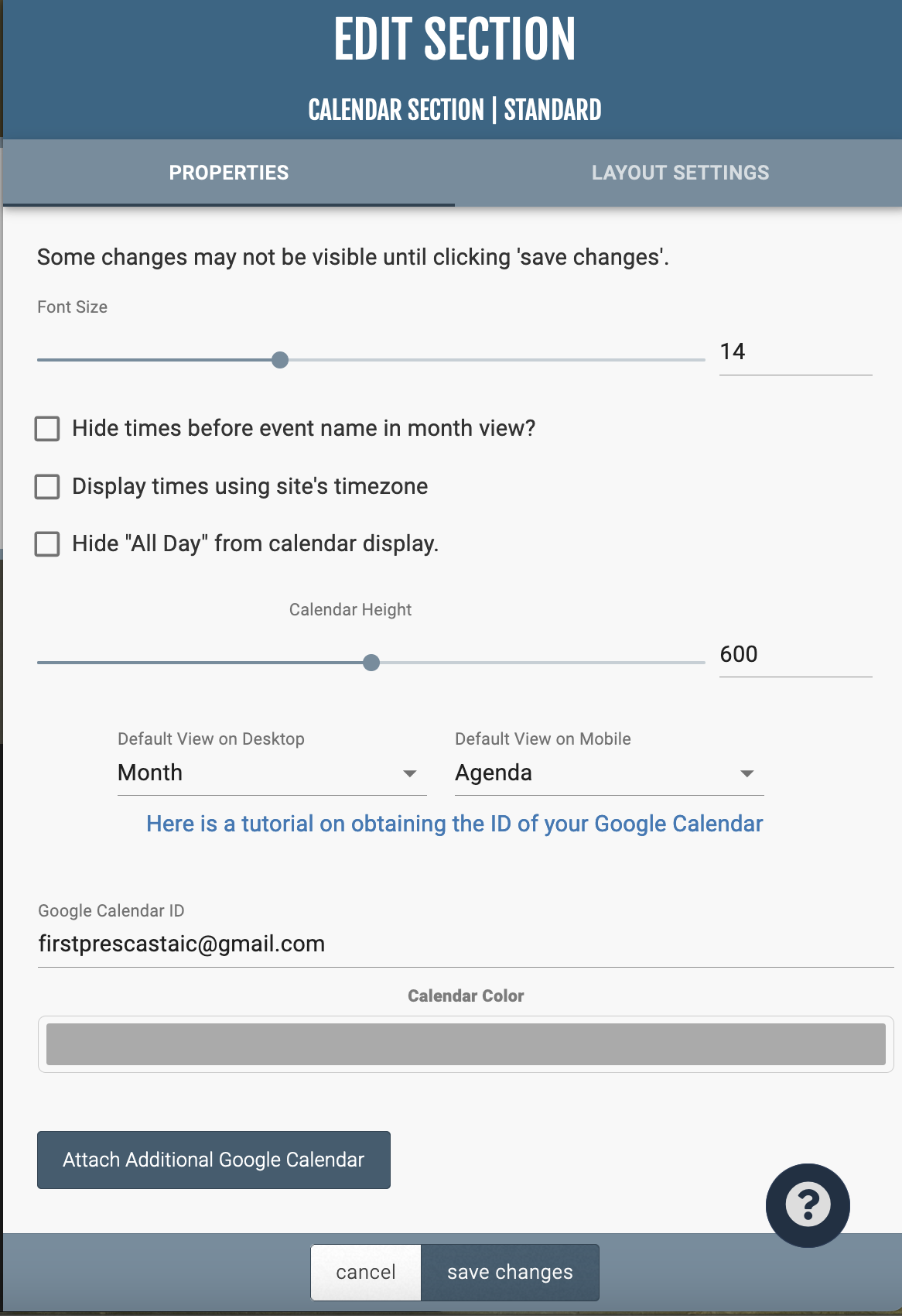
In “Section Properties,” you can manage the font size and timing options for events. You can as well change the color options of the calendar and add calendars to be overlayed over each other.
This section, similar to the Comment Wall, adds a public chat box where multiple users can communicate with one another.
To clear the the chat box, click the trashcan icon at the top right.
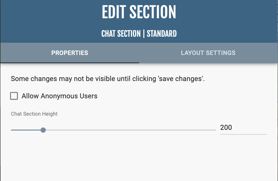
In “Section Properties,” you can manage whether anonymous users can use the chat box and the height of the chat box.
This section, similar to the Chat section, allows users to display public comments on a webpage.

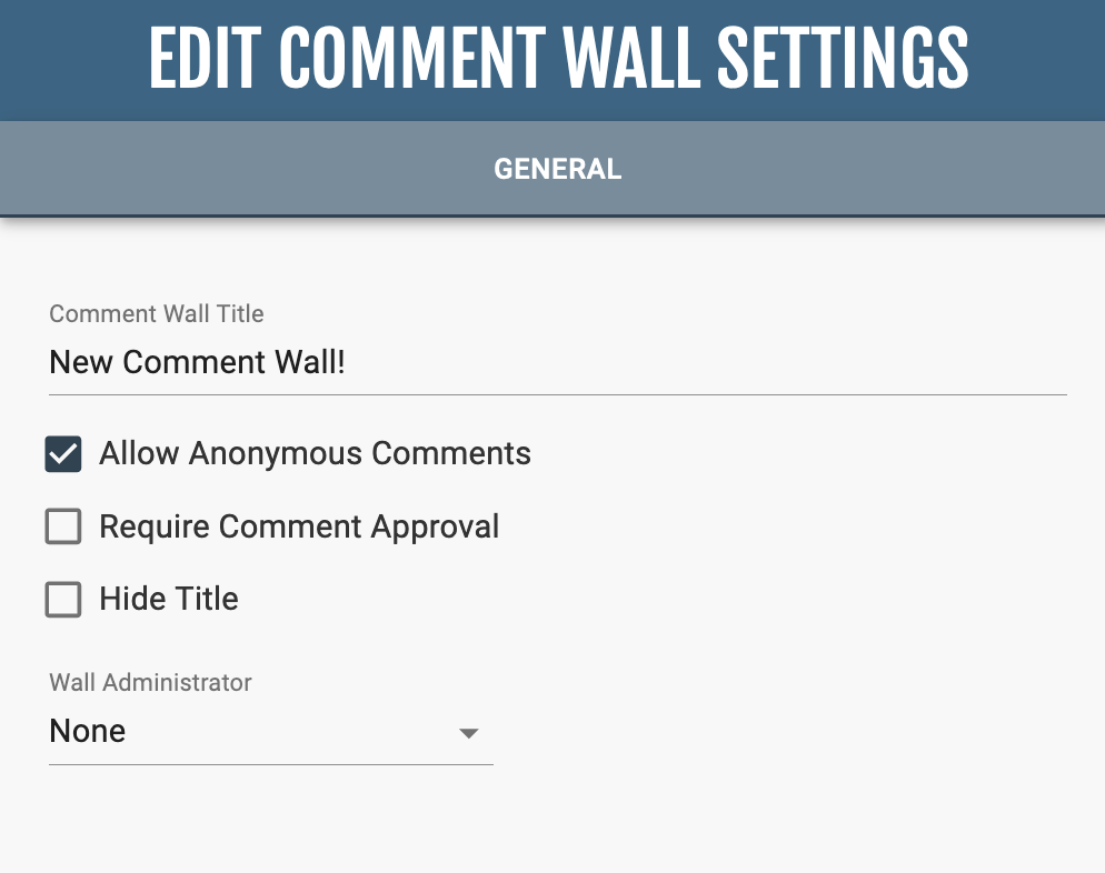
Unlike the majority of sections, the settings can be found in “Edit Wall Settings.” Here you can choose to allow anonymous comments, to require approval of comments by an administrator before being public and who the authorized administrator is.
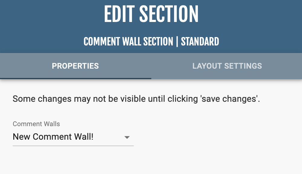
The “Seciton Properties” manages which comment wall is displayed.
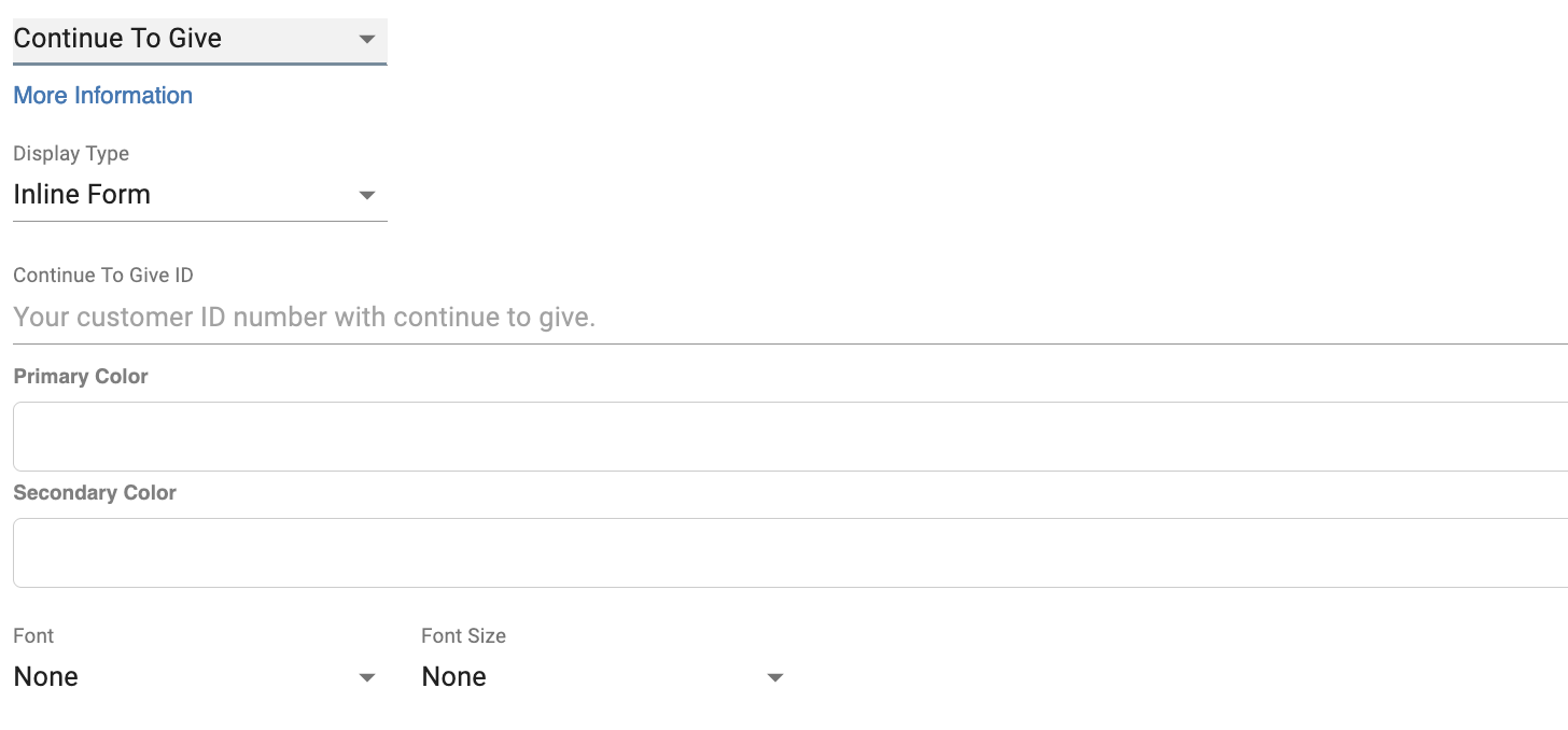
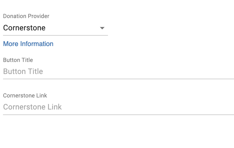
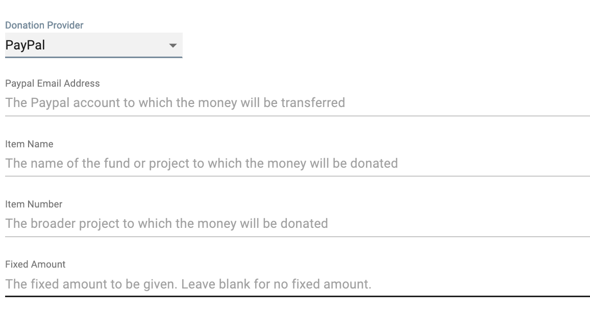
This section provides a simple integration of giving providers with your website in a simple button.

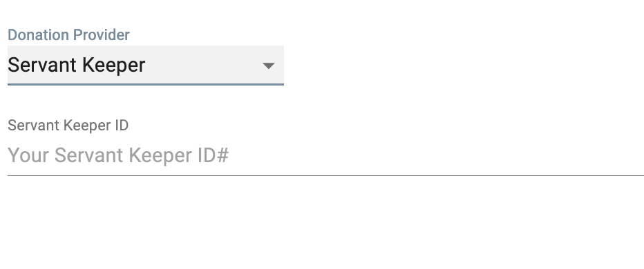
The giving options are Servant Keeper, PayPal, Continue to Give, Cornerstone. Each provider has different inputs required to properly connect to each giving provider.
This section multiple pages of information, with tabs. You can edit the text of each page like any text section.
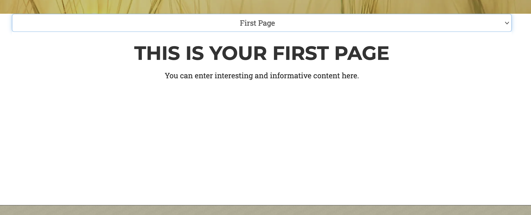

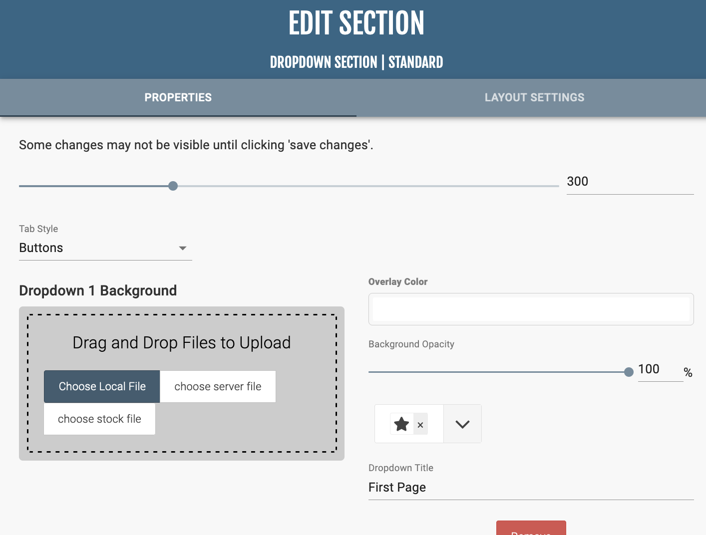
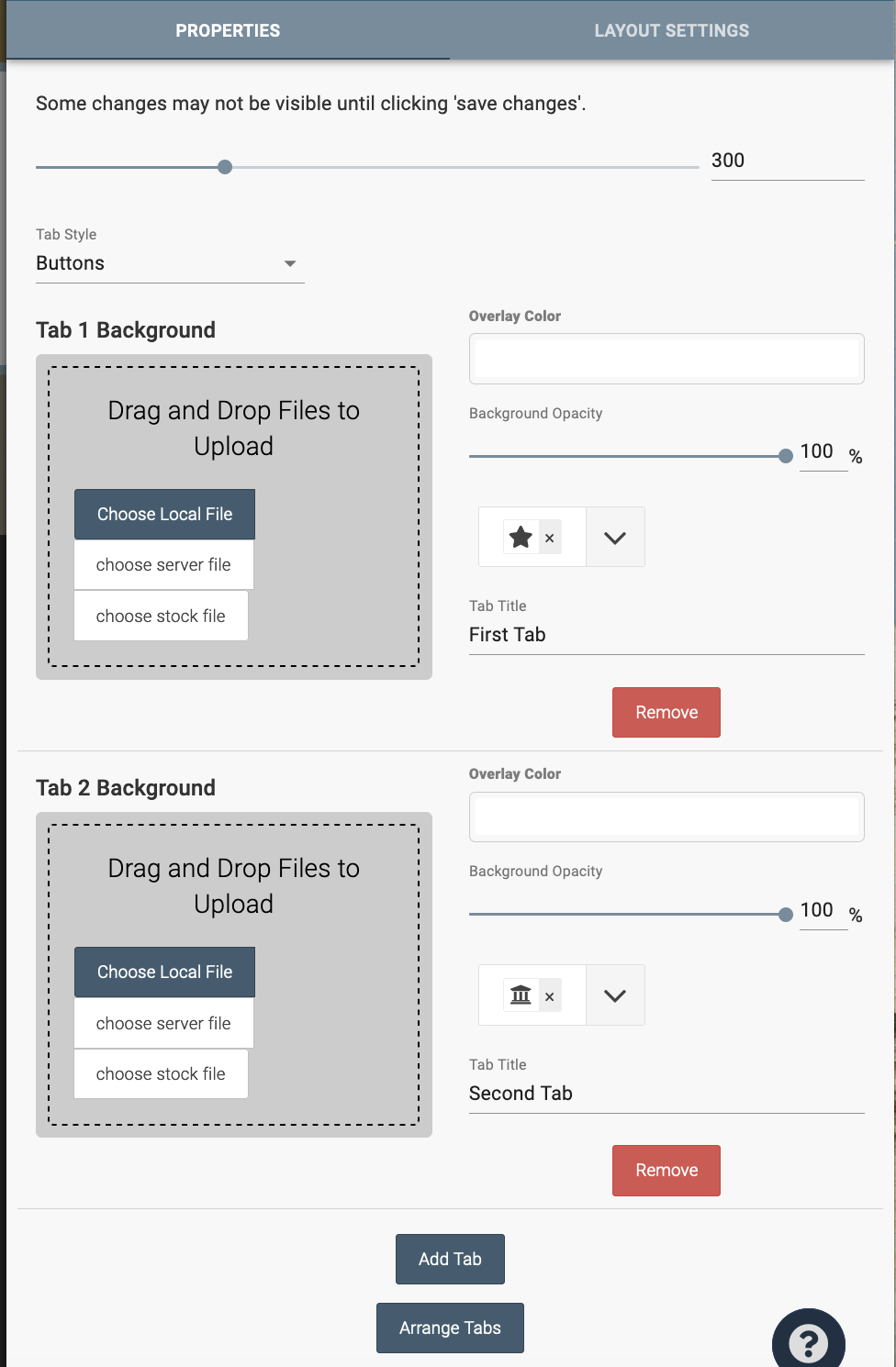
In “Section Properties,” you can change the dropdown titles and background images, overlay color and opacity, and button style. Similar to the Tiles section, you can add more tabs and arrange tabs at the bottom of the editor.
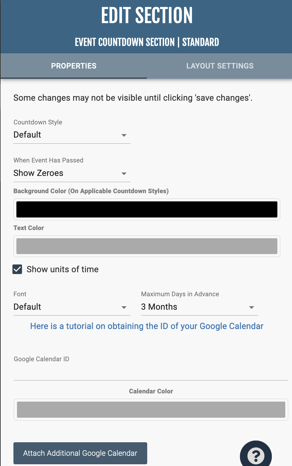
This section displays a countdown timer for a specified event.

In “Section Properties,” you can edit the style and display of the countdown.
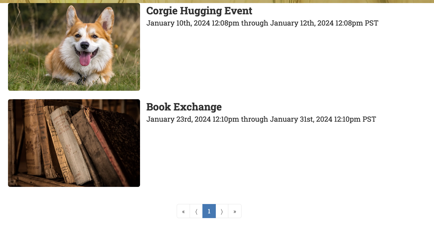
This section displays a vertical list of inputted events. It is a great alternative to the Calendar section if you do not wish to create a Google Calendar and sync it to the website.
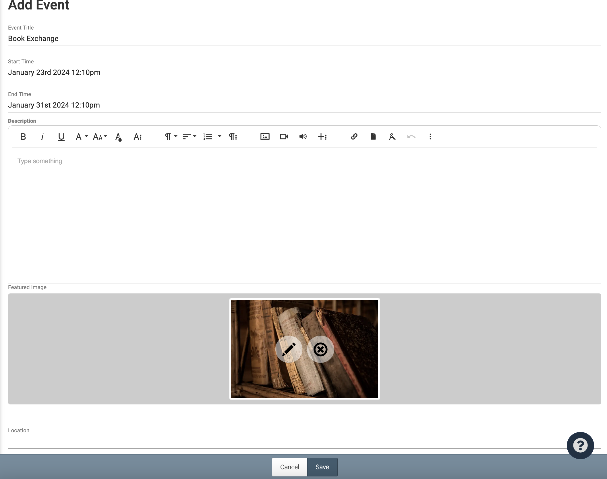
You must manually add events by clicking “Edit Events,” and then the plus button at the bottom right of the screen.
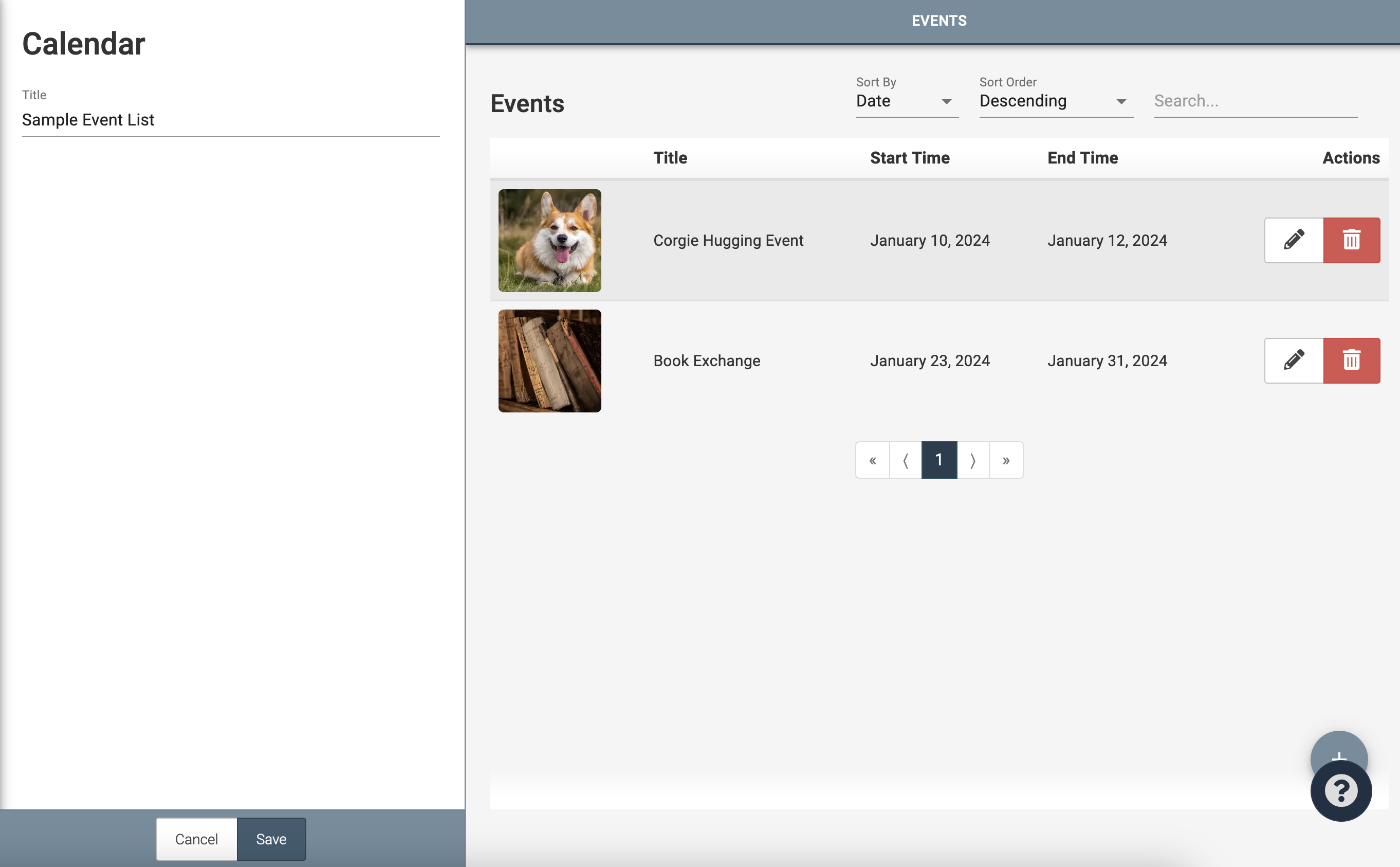
Here you can insert the Event Title, start and end time, a description of the event, an image, and a location.
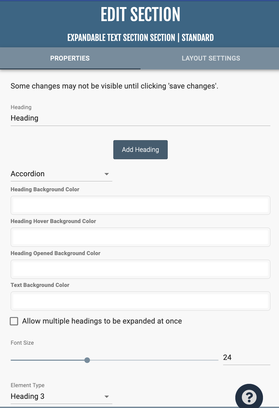
This section displays either a singular or multiple headings, that when clicked expand downward to display a text section.

In “Section Properties,” you can rename, add, and arrange headings. When arranging headings, arrange the headings from left to right as you would like them to display top to bottom. Below the headings, there is a dropdown menu where you can choose from four different styles of headings: Accordion, Information, Basic, and Accordion Minimal. The controls for heading and text colors, font size, and paragraph style of the headings are found at the bottom of the page.
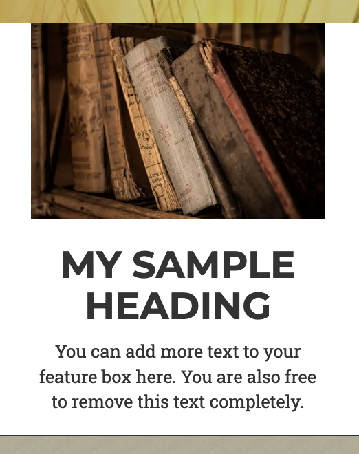
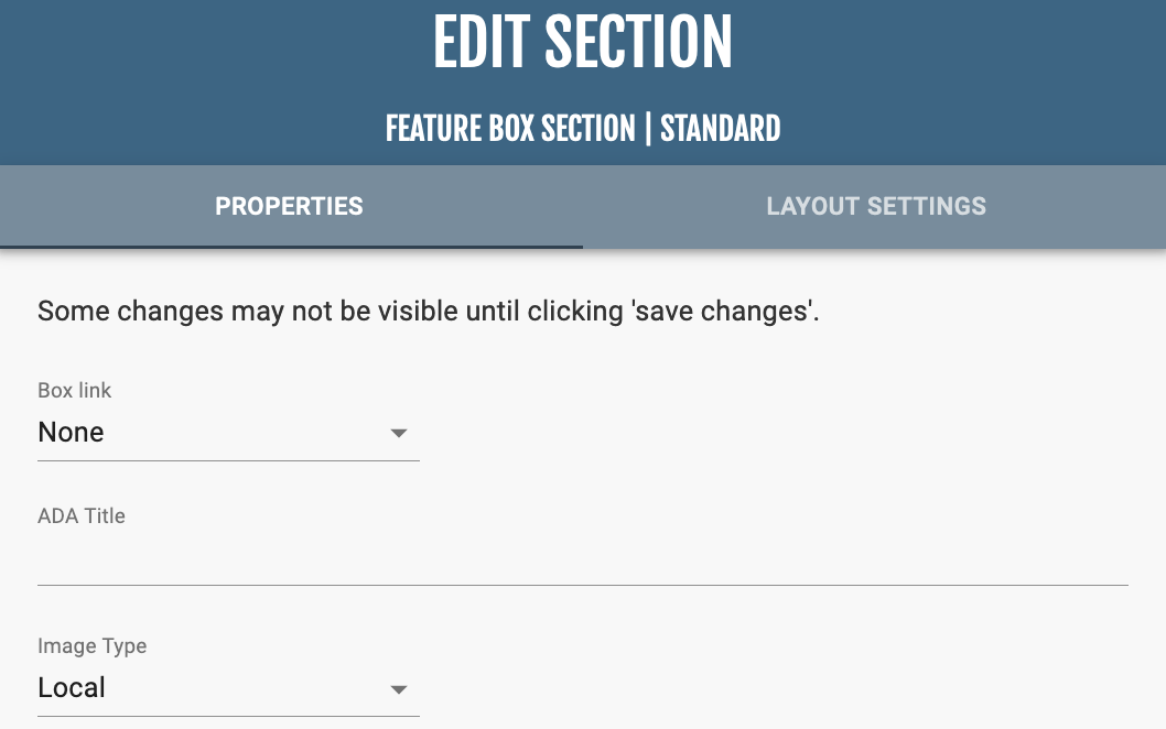
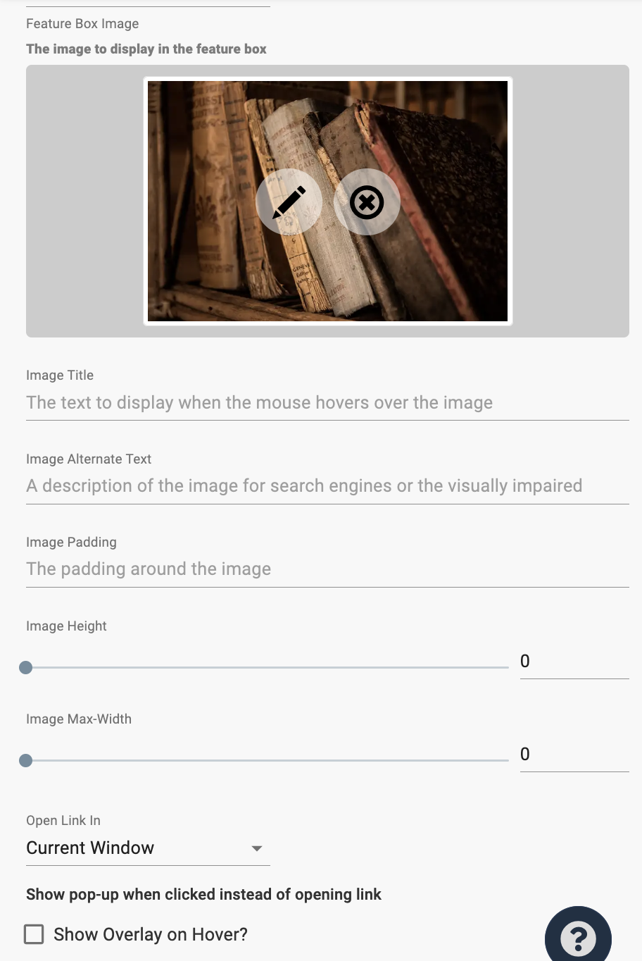
The Feature Box section displays a picture, a title, and a small description.
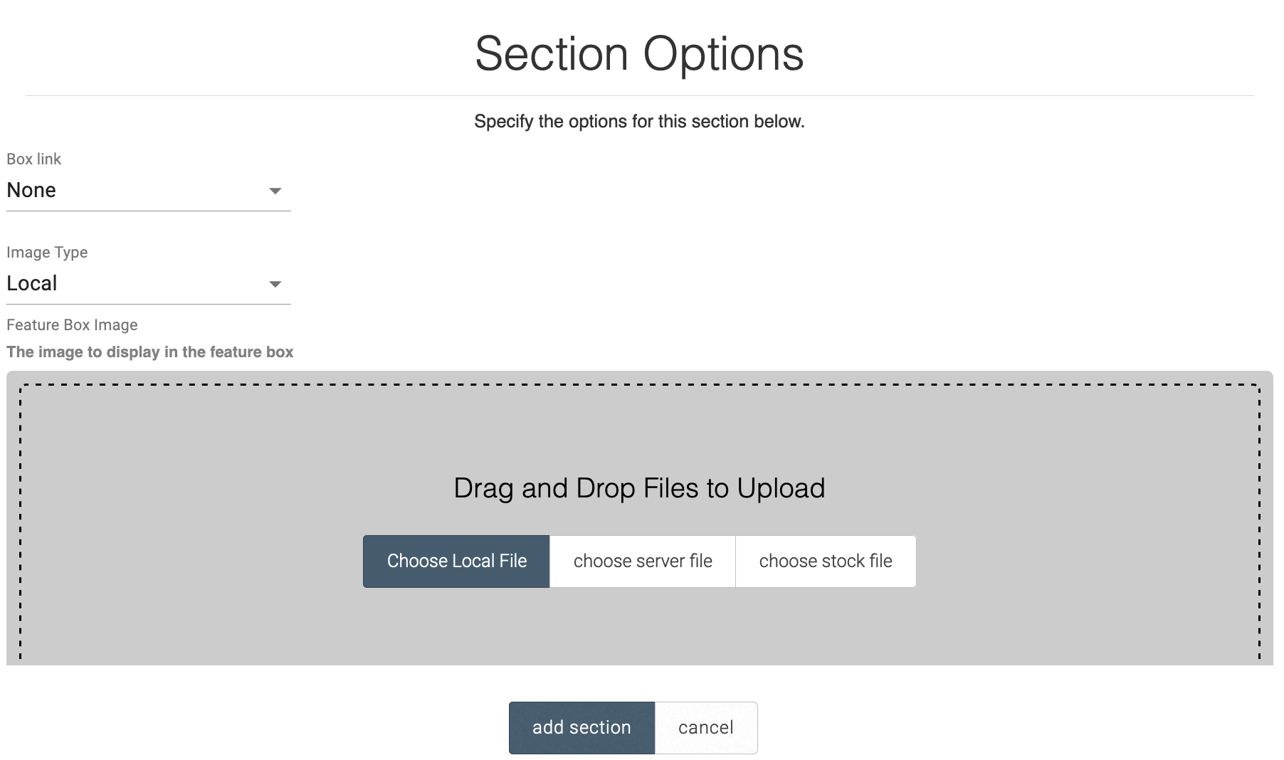
You can choose to link the image to a page, blog, site, external link, etc. so that the user is taken to the linked item. You can upload images either from a local device / server file / stock file or by providing a link to the image.
In the “Section Properties,” you can adjust the image height and width, the location of where the link connected to the image is opened, and any animations for the section.
This area of documentation provides information on forms and the fields that can be added to forms.
Form Creation
Form Settings
General Settings Tab
Input the email you would like to receive the form responses in “Submission E-mail.” Multiple emails must be separated by a comma
If you have Instruction Field(s) in your form, selecting “Include Instructions in Email” will keep the instructions in there. Keep the box unselected will remove the Instructions Field(s) and keep all other fields.
If you would like email confirmations to appear as coming from a particular email address, input it in the “Sending Email” area. For example, if you want email confirmations appearing to come from a particular pastor or staff member, place their email here. The “Sending Name” follows the same concept, but with the name of the sender and not the email address.
The “Form Submit Text” area will change the text of the “Submit” button at the bottom of the form. The default text is “Submit.”
There are two options for On-page confirmations.
There are two options to limit how many people may fill out the form. The Submission Limit will only allow a certain amount of submissions of the form. The Quantity Field functions similarly, but on a more individual level that counts by data inputted into the Quantity Field. When selecting Quantity Limit, make sure to select the proper quantity field that will the be determiner for when to close the form.
For example, let’s say you have a registration form for a youth summer camp that only has 50 available spots. If you used the Submission Limit, a mom signing up her 4 children through one form submission would reduce the available spots to 49. However, if the Quantity Limit is selected, then it will reduce to 46 available spots.
In the “Payment Processor” dropdown menu, select what process you are using and the corresponding information that will connect the form to your account in the payment processor.
Email Confirmations
The second menu tab allows the user to decide if a confirmation email is sent out after the form is completed. Write a stock email that will be sent to all users who fill out the form. For information on text editing, refer to Plain Text section.Choice Information
In many of the Form Fields, there are editable Choices that have four options.• “Name” – The name of the Choice that will be visible to the user.
• “Value” – If the Choice has a value that differs than its name, input the value here.
• “Default” – Checking this box makes the option the default option selected unless otherwise chosen.
• “Currency Value” – If a Choice is purchasable, then you can give a dollar amount that will be used in processing the transaction.
After adding the section, replace the default text with your heading and optional sub-heading. If you would not like the subtitle, you can delete the text and leave it as blank.

Upon clicking Section Properties in the upper right corner, you can add shadows and animations to your heading.
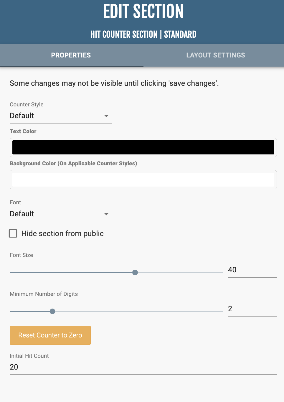
This section displays how many times the page has been visited after the section is added.
In “Section Properties,” you can edit the style of the counter (Default, Squares, Circles), the corresponding style colors, and font size. At the bottom of the menu, you can adjust the minimum number of digits, reset the counter, and set an initial count for the counter.
If you have an HTML embed link from an outside program or resource, you can paste the code in this section to have it appear on the site. While still in the menu of adding the section, you can select whether the it is an Inline or iFrame embed. The slider underneath the Embed Type dropdown controls the height of the HTML section.
This section contains a small icon, a bold heading, and small subtitle.
In “Section Properties,” you can manage where the icon box is linked to and the colors of the text, icon, and backgrounds.
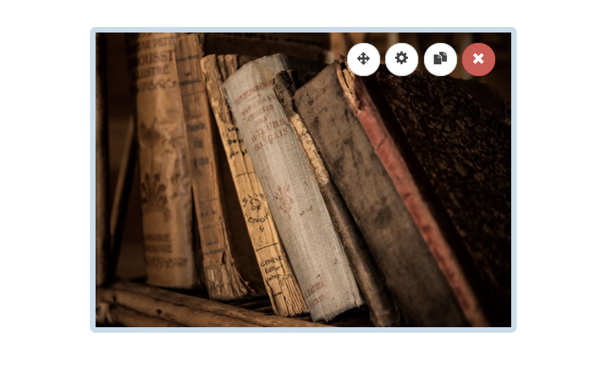
This section places a single image on your webpage.
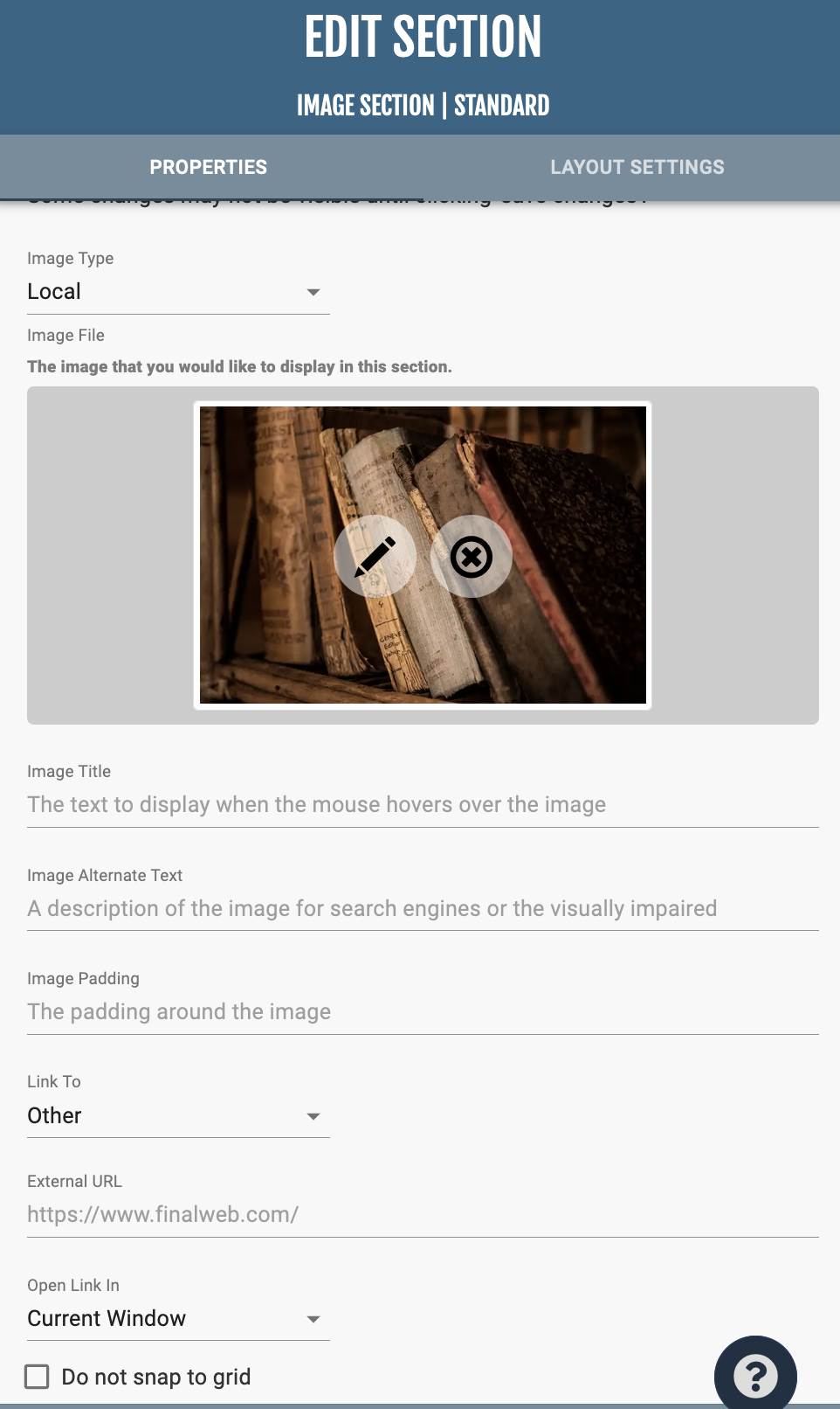
Upon selecting the section, there is an “Image Type” dropdown.
In the Local option, there are three options:
In the Sections Properties, you can add a hover image title, other text information, and link the image to an external URL. The checkbox “Do not snap to grid” allows greater flexibility in where you are able to arrange the image in a group. In the “Layout Settings,” you can apply a border and animations to the image.
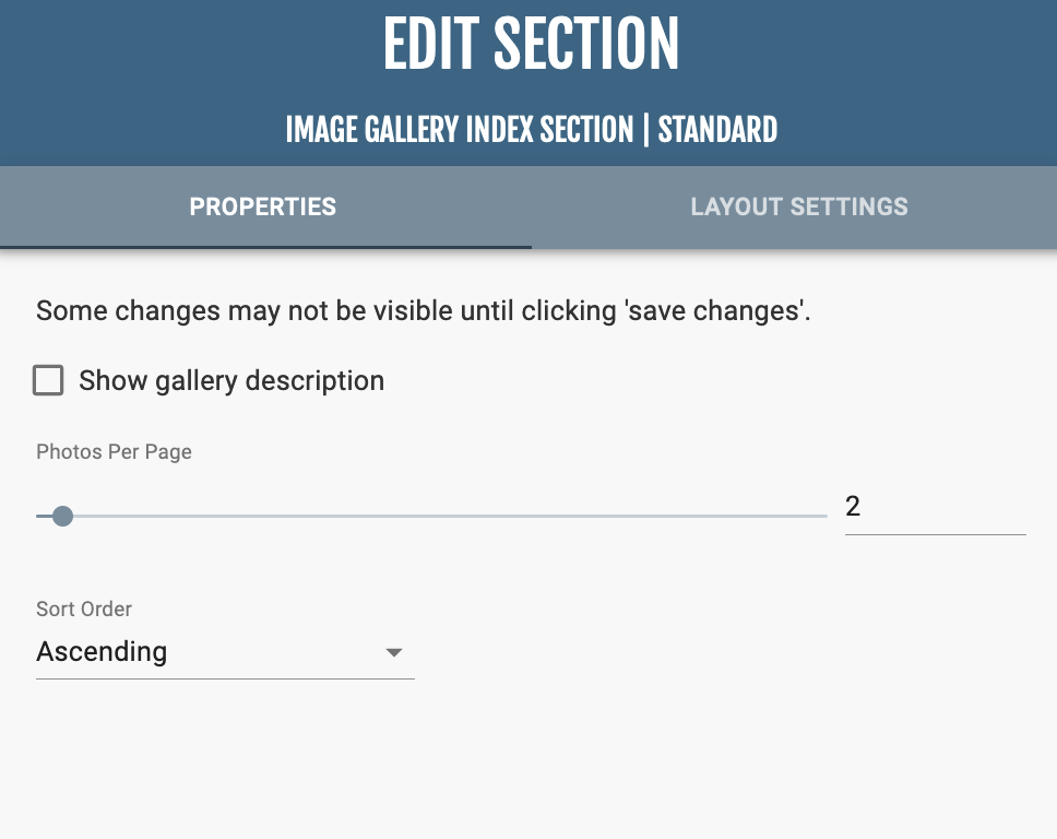
This section displays all the photo galleries on the website.
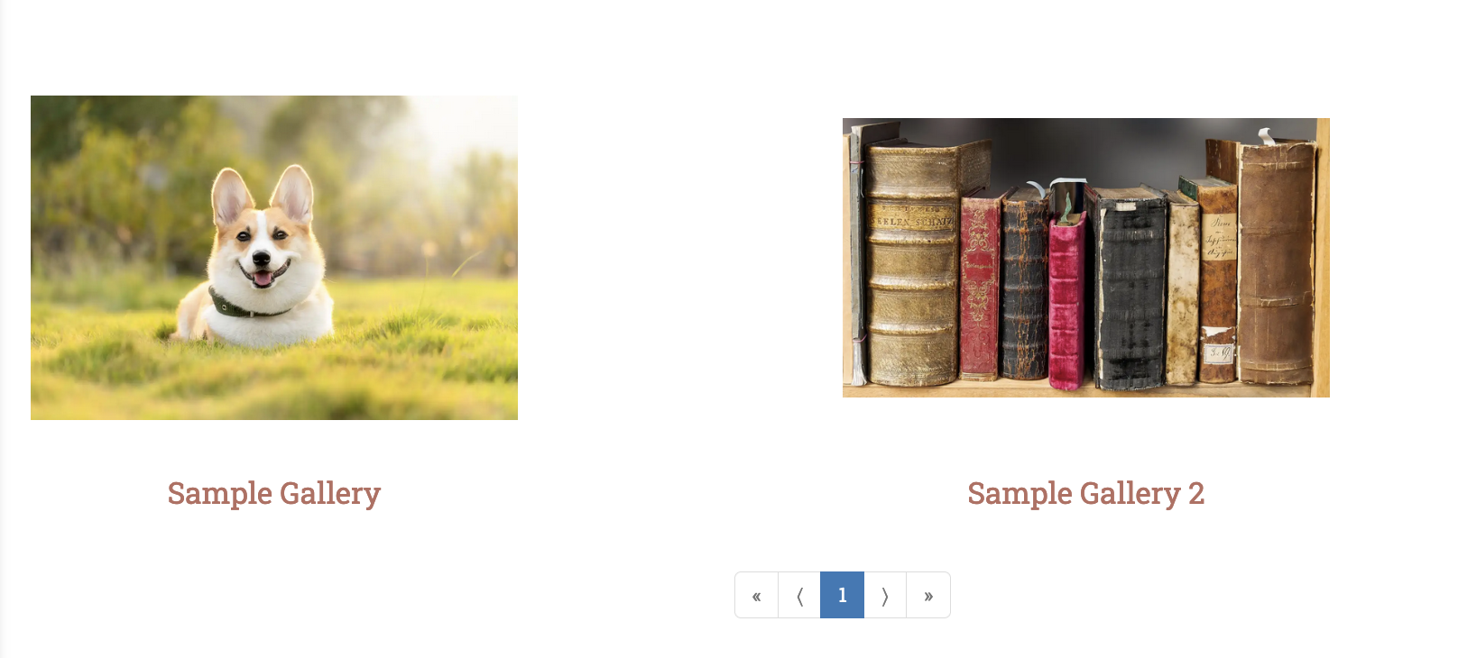
In “Section Properties,” the Photos Per Page controls how many galleries are shown on a single pages.
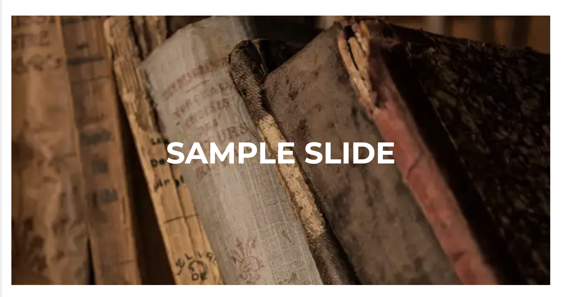
The Jumbotron section is a good way to get people’s attention to a specific action you want them to take when they land on your site. It is recommended to choose a background image, video, or texture for the group that the Jumbotron section is in.

In “Section Properties,” you can adjust the height of the Jumbotron.
The Jumbotron Carousel section is a good way to get people’s attention to a specific action you want them to take when they land on your site.
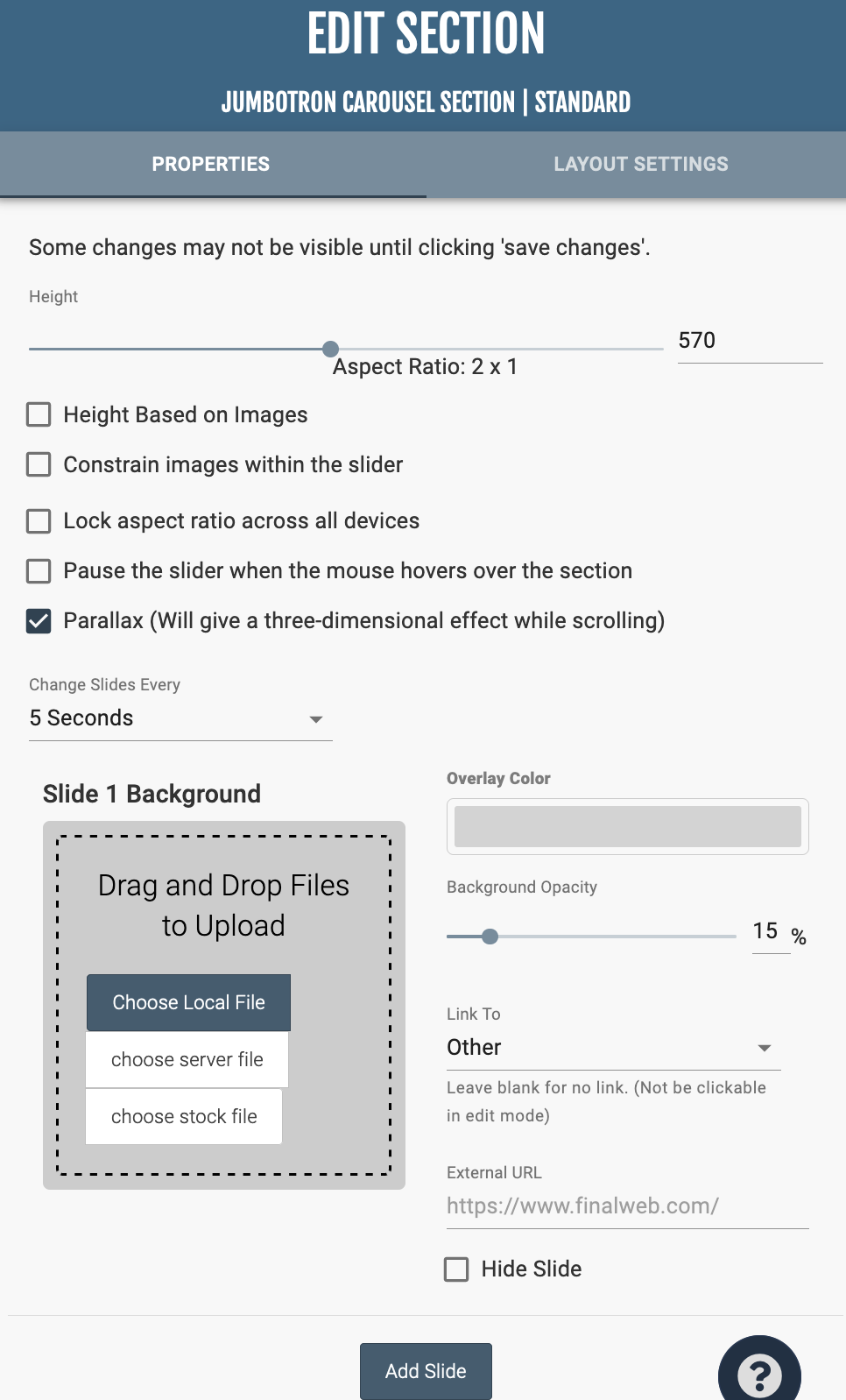
After adding the section, click the gear icon on the top right of the section, and you can create more slides. In the “Section Properties” menu, there are a variety of options to edit the height of the Carousel. You can manage how fast the slides change under the checkboxes.
For each slide, an image can be uploaded and can be linked to another page or external site. The overlay color and Background Opacity color control the darkness of the image.
At the bottom of the “Section Properties,” you can add more slides or arrange the existing slides.
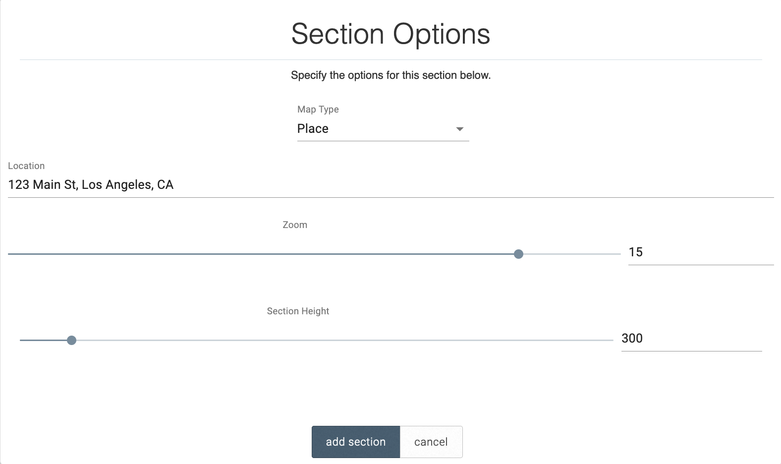
This embeds a Google map onto your page to either show you a location (Place) or provides directions between two given locations (Directions).
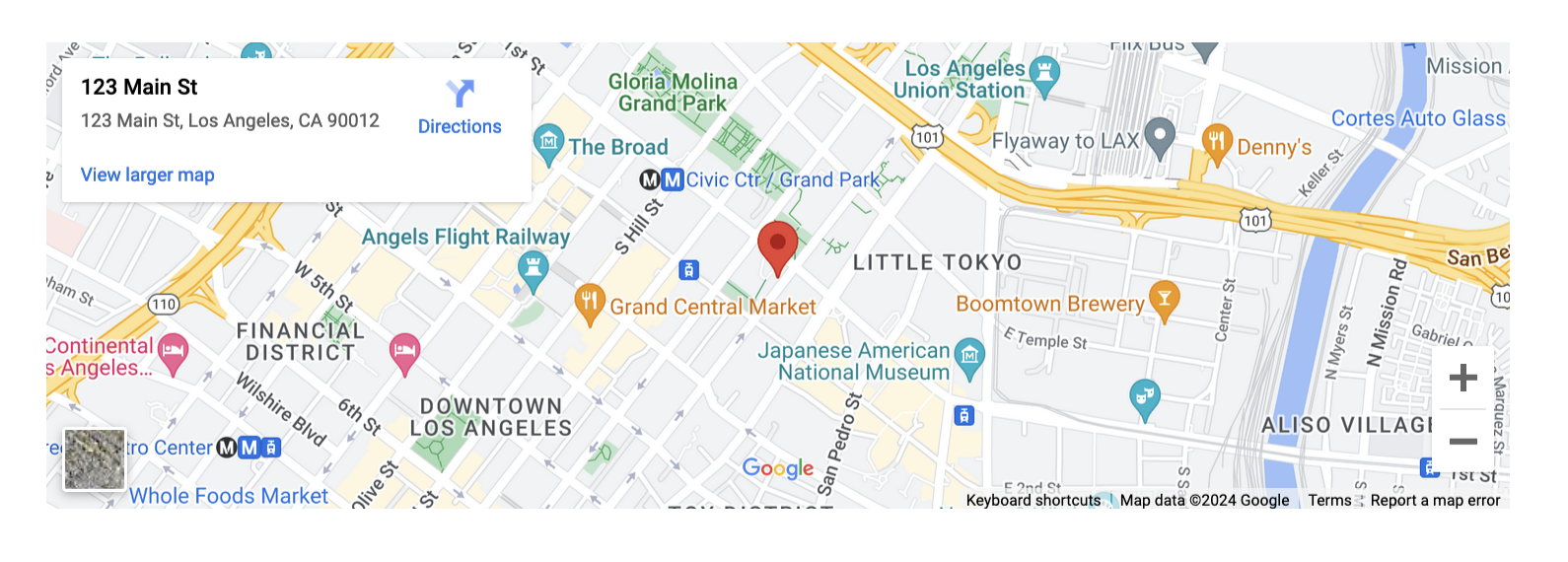
Use the sliders to adjust the zoom on the map and the height of the section.
There are seven kinds of Media Libraries
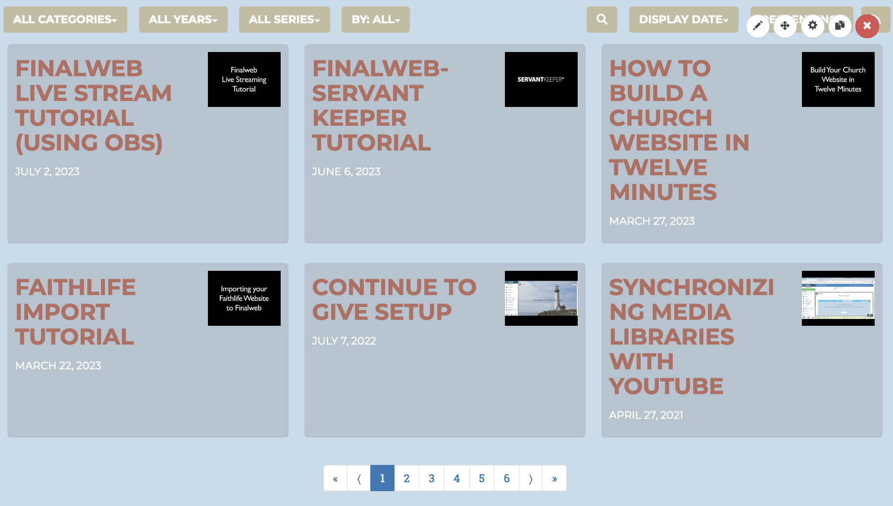
Edit Media Library
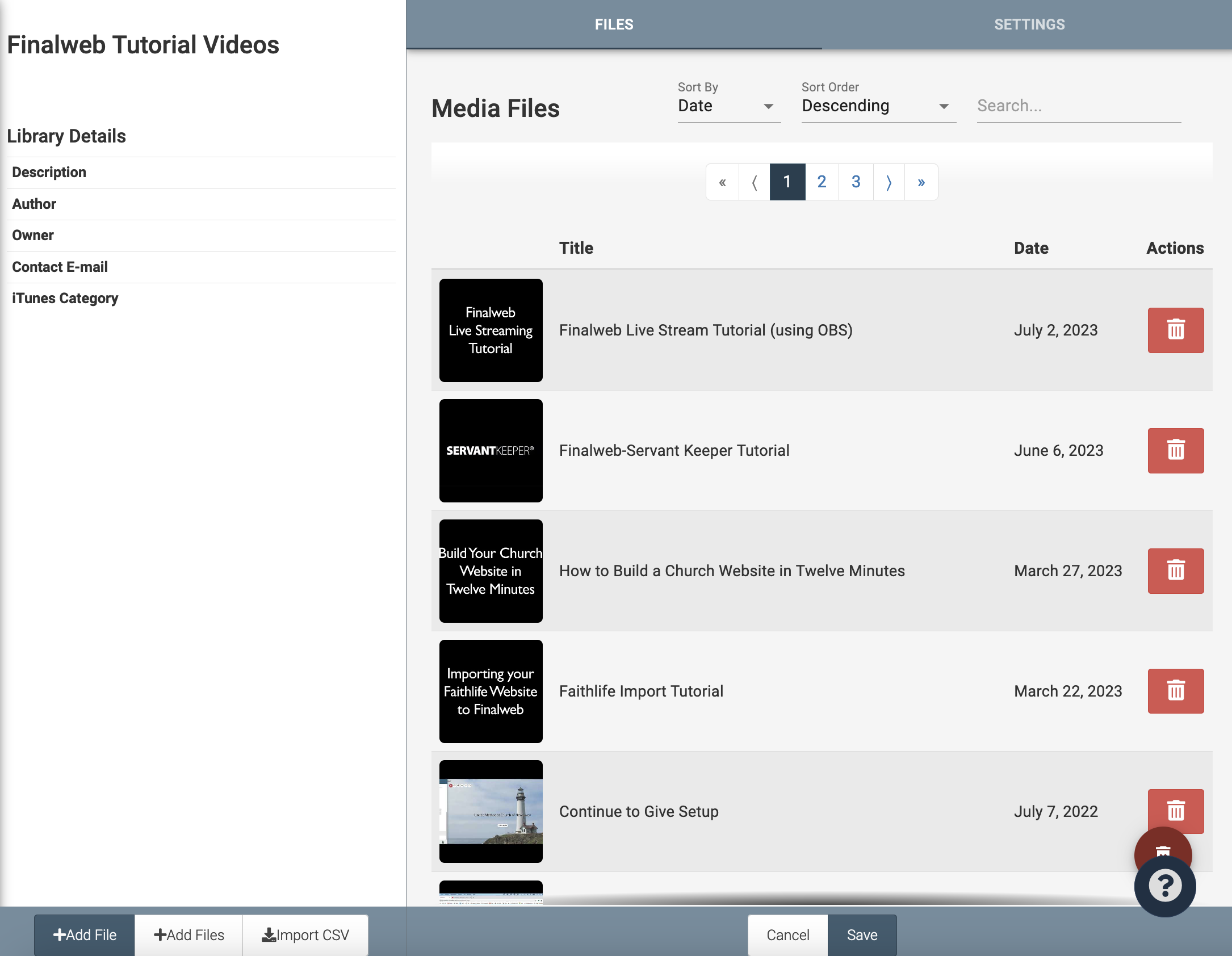
To edit the contents of the library, click the pencil icon at the top right of the Media Library that says “Edit Media Library.” Here you can edit the contents of individual videos / files and the library as a whole.
You can add files to the Media Library at the bottom left of the screen, either individually or in a batch, or from a CSV file.
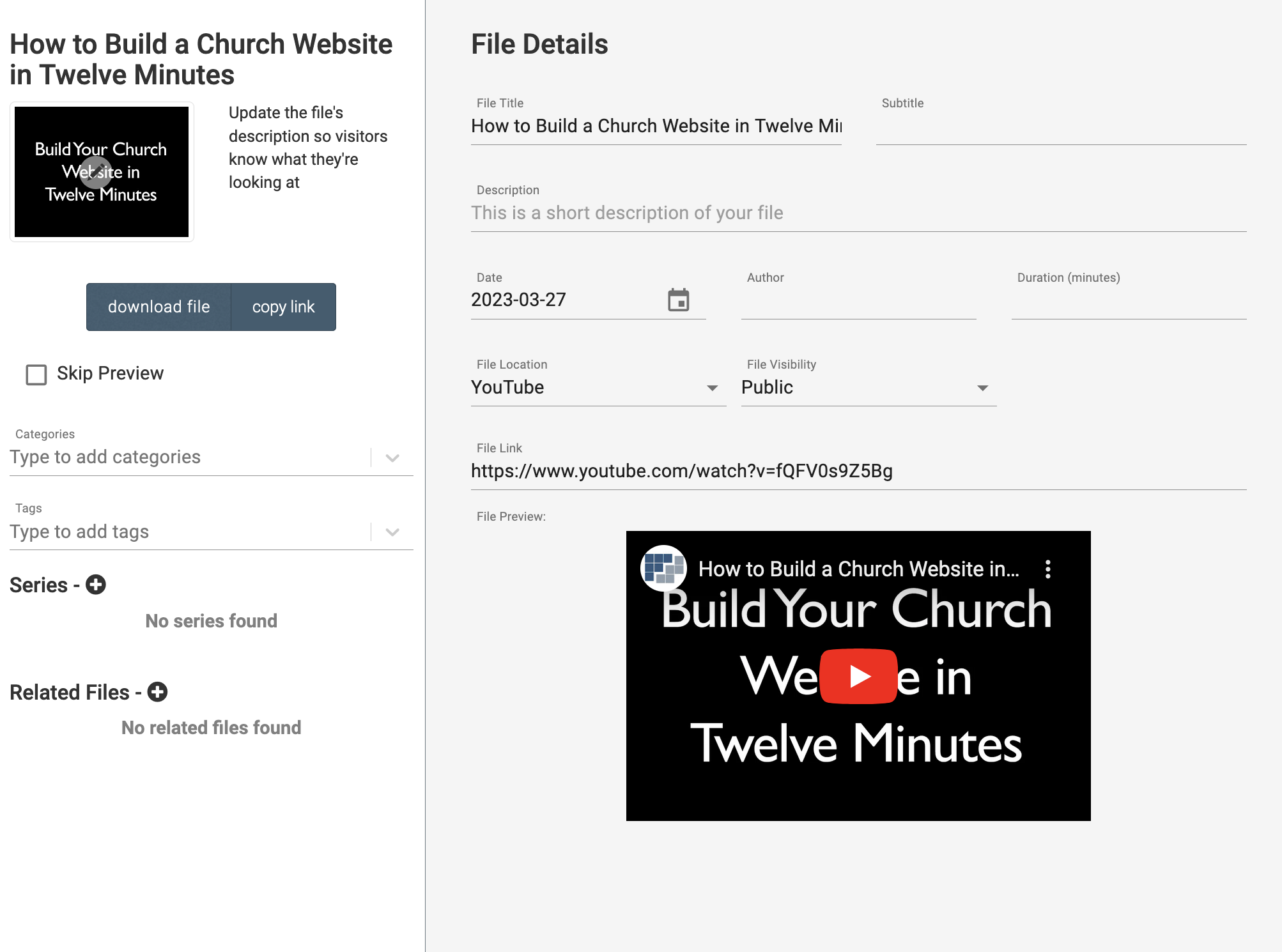
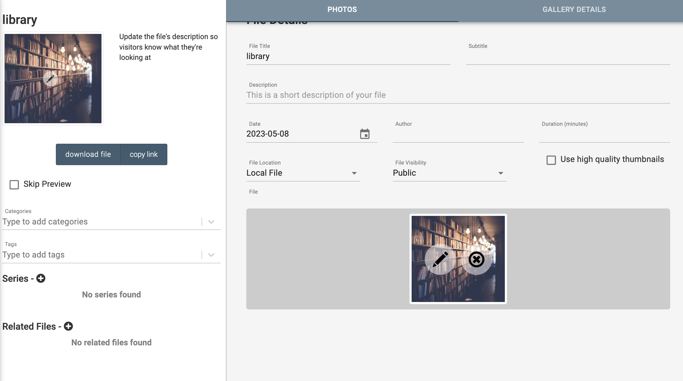
After adding a file, you will be directed to the File Editor. You can reach the File Editor by clicking on a file in the Edit Media Library Menu. On the left side of the screen, you can manage categories, tags, and series that the file can be searched by. As well, you can here download the file or get a shareable link for others to download the file. On the right side of the screen, you can manage, the File title, subtitle, description, date, author, file visibility, and other information about the file. Make sure you click save after editing a file!
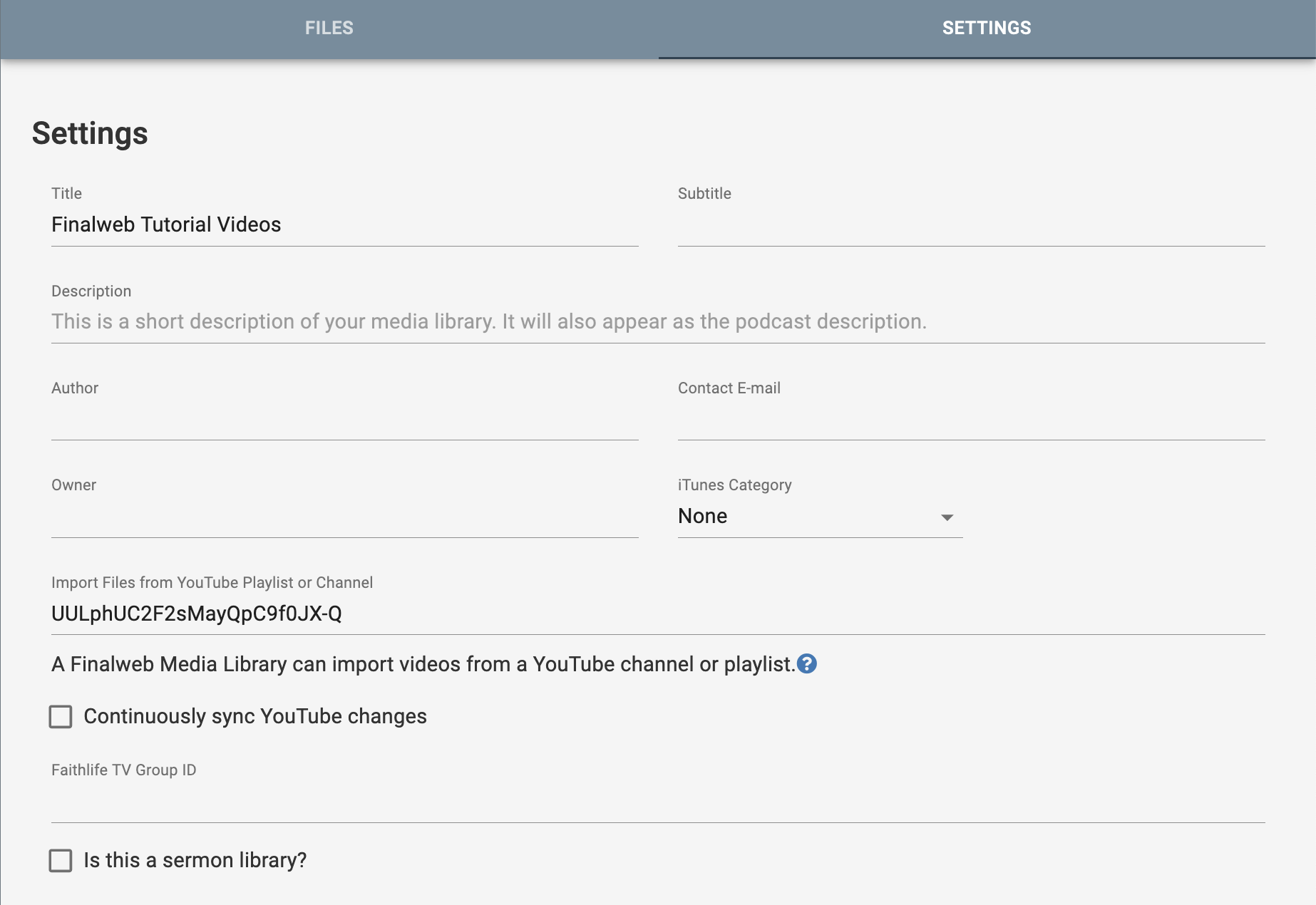
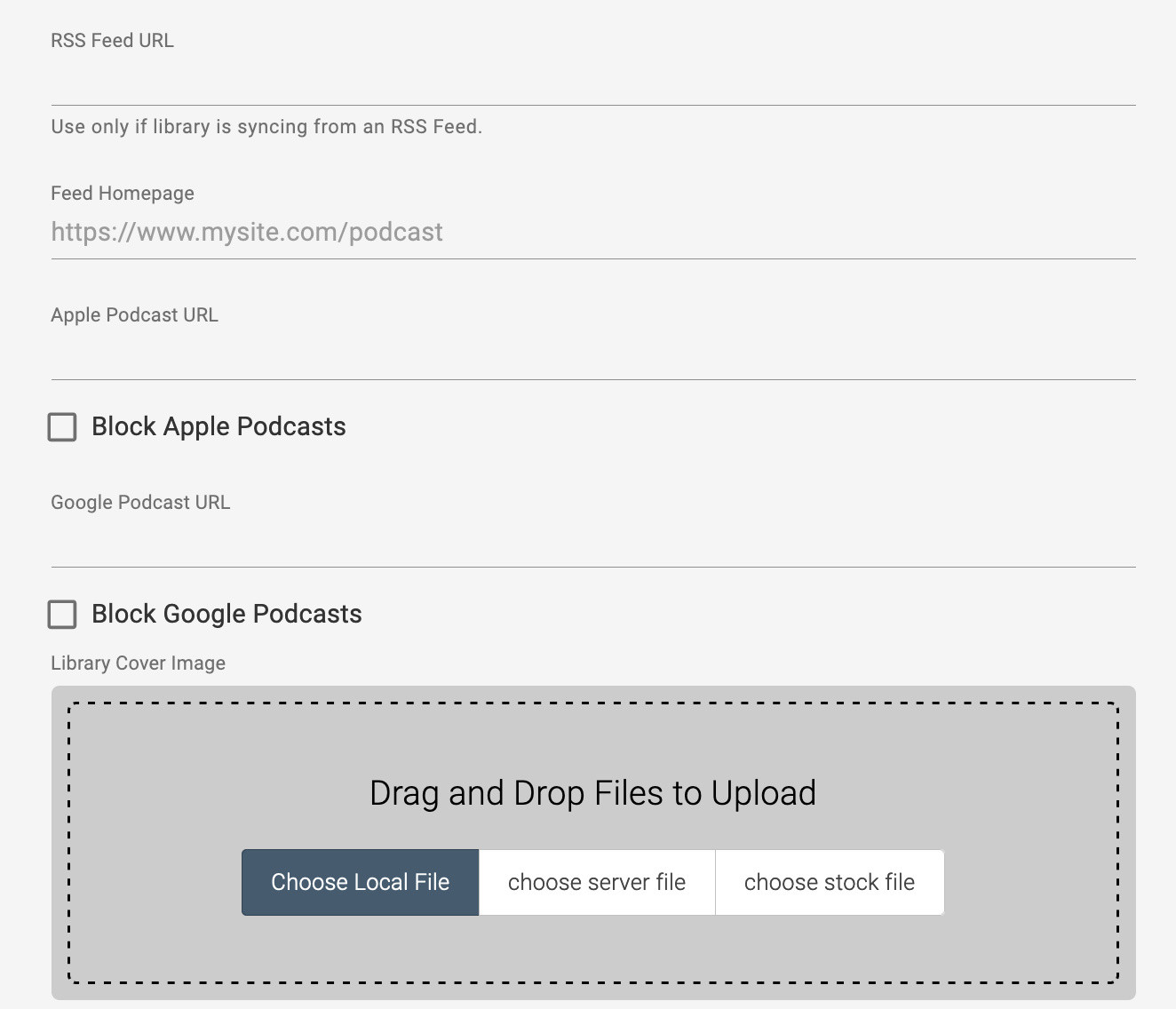
Returning to the Edit Media Library screen, there is a “Settings” tab at the upper right. Here you can manage information related to the library. It is here where you can sync an existing Media Library to another video or streaming provider, such as a YouTube channel or playlist, Faithlife TV, RSS Feed, Apple Podcast, and Google Podcasts. If you submit an RSS feed to Google or Apple, inserting the URLs makes it easier for users to access and subscribe to the particular podcast. The URL links displays the icons at the top of the Media Library.
Section Properties
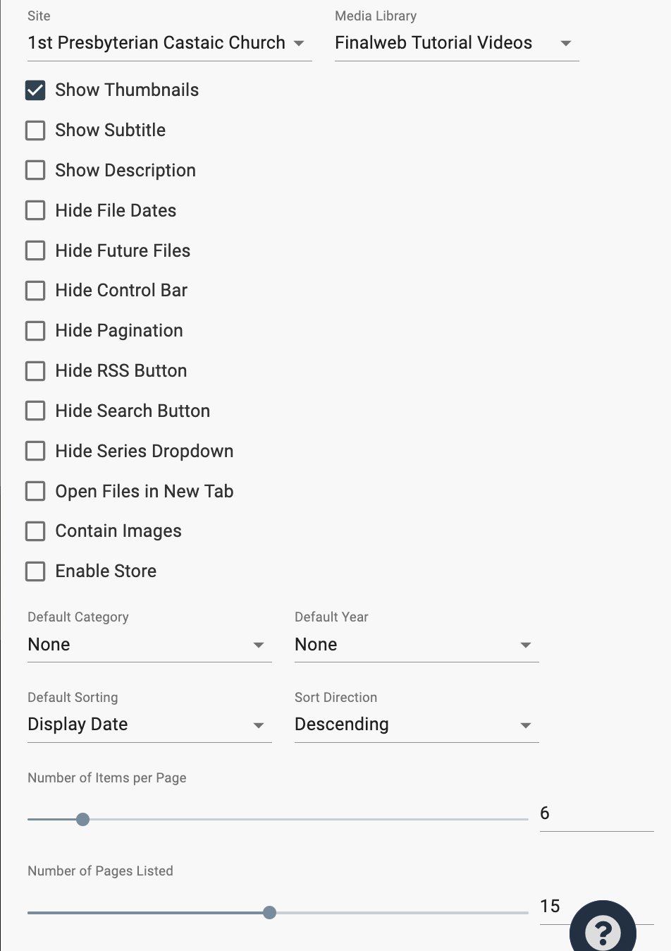
The second control area is the familiar gear icon labeled “Section Properties,” located when looking at a Media Library on a webpage.The opening page is the Properties tab. At the top, you can specify the site and particular Media Library. The rest of the page provides a series options on how the Media Library appears on a webpage, what items are displayed first and their organization, and how many items on a page and pages listed at the bottom of the library.
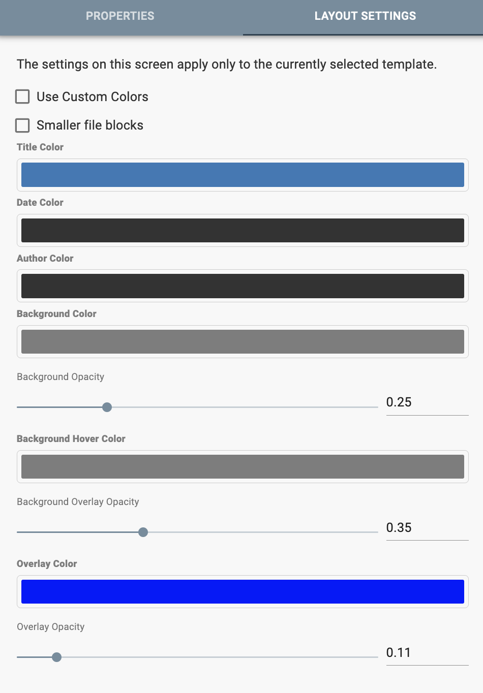
On the Layout Settings Tab, you can select ‘Custom Colors’ to use different colors than those provided from the Template Settings. There are custom title, date, author, background and background hover, and overlay colors.
This section displays a membership directory on a page, which you can view information about families or individual members.
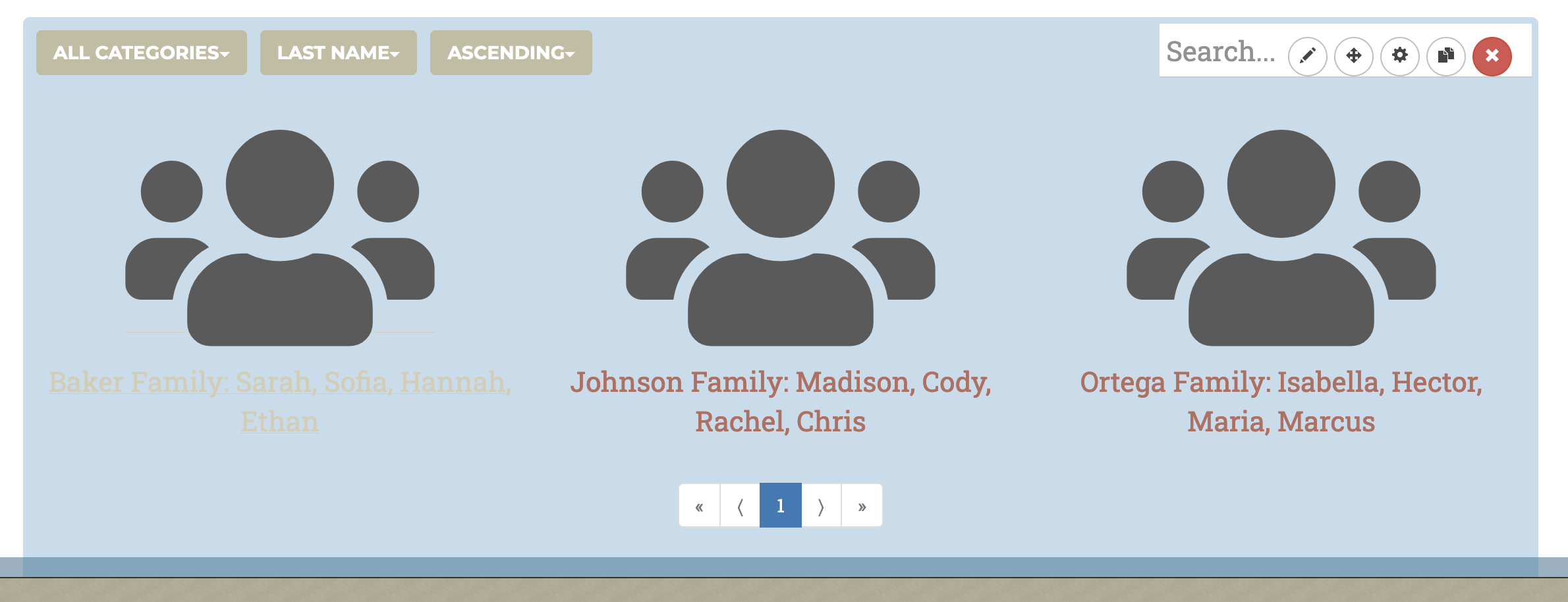
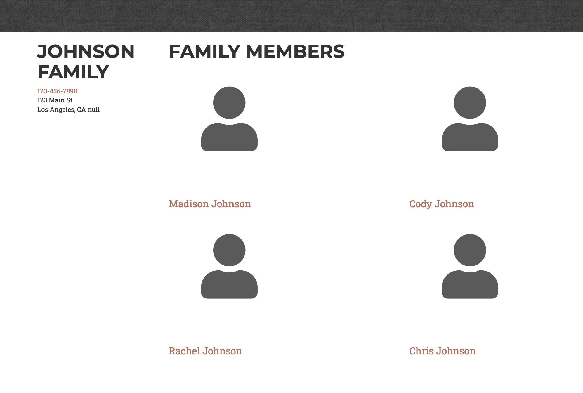

Creating a Membership Directory
Directory Admin Panel
There are four icons in the Membership Directory Menu
Adding & Modifying Members
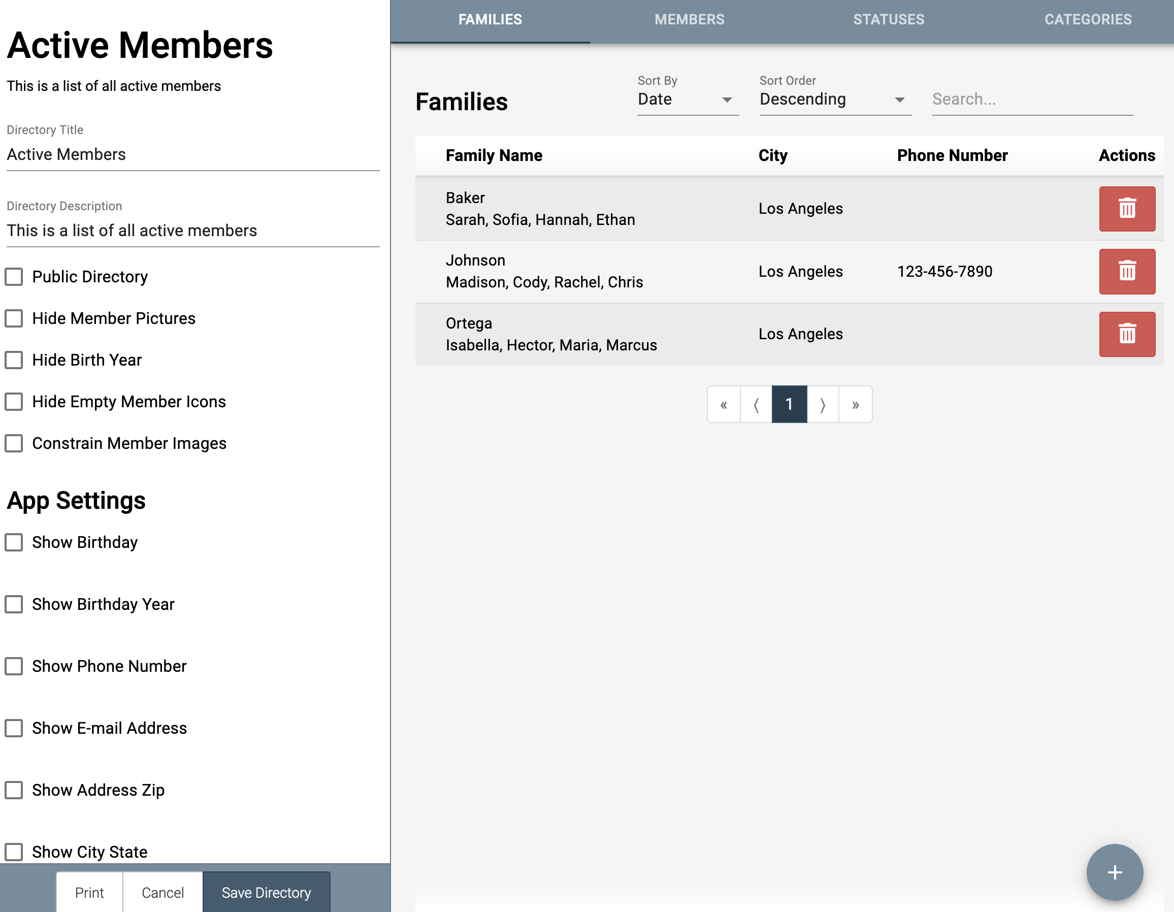
There are four tabs to manage members: Families, Members, Statuses, and Categories. In order to add individual members, you must first create a family.
Side Bar
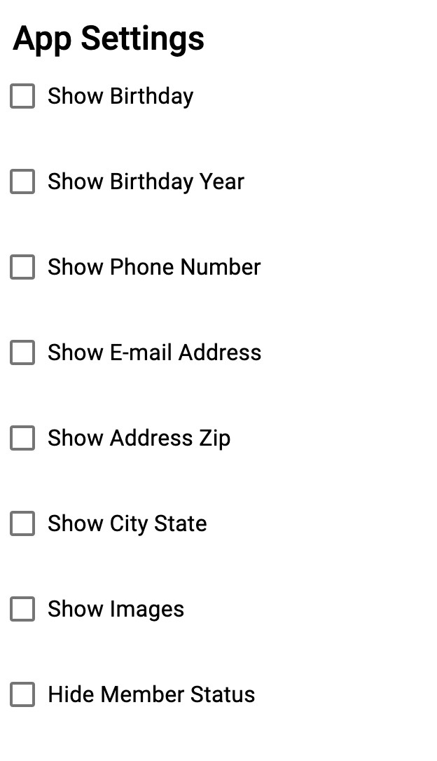
This side bar provides basic information about the directory and what information is displayed about members to users. If you are using the mobile app, you can toggle what information is displayed on the app directory.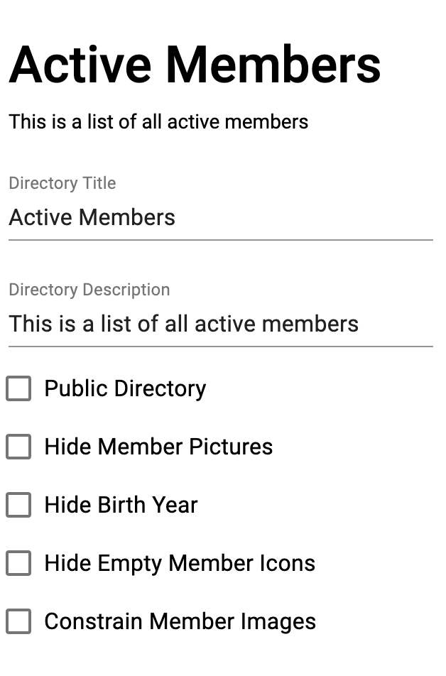
Family
Status
You can add additional membership statuses under this tab, and can be assigned under the Membership Status dropdown located on each Member.This sections creates a horizontal menu.
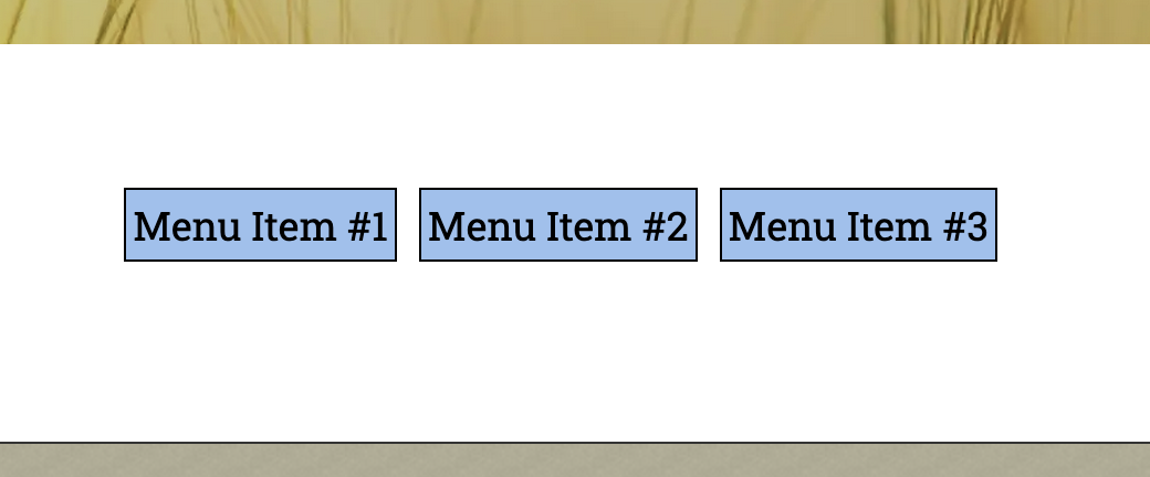
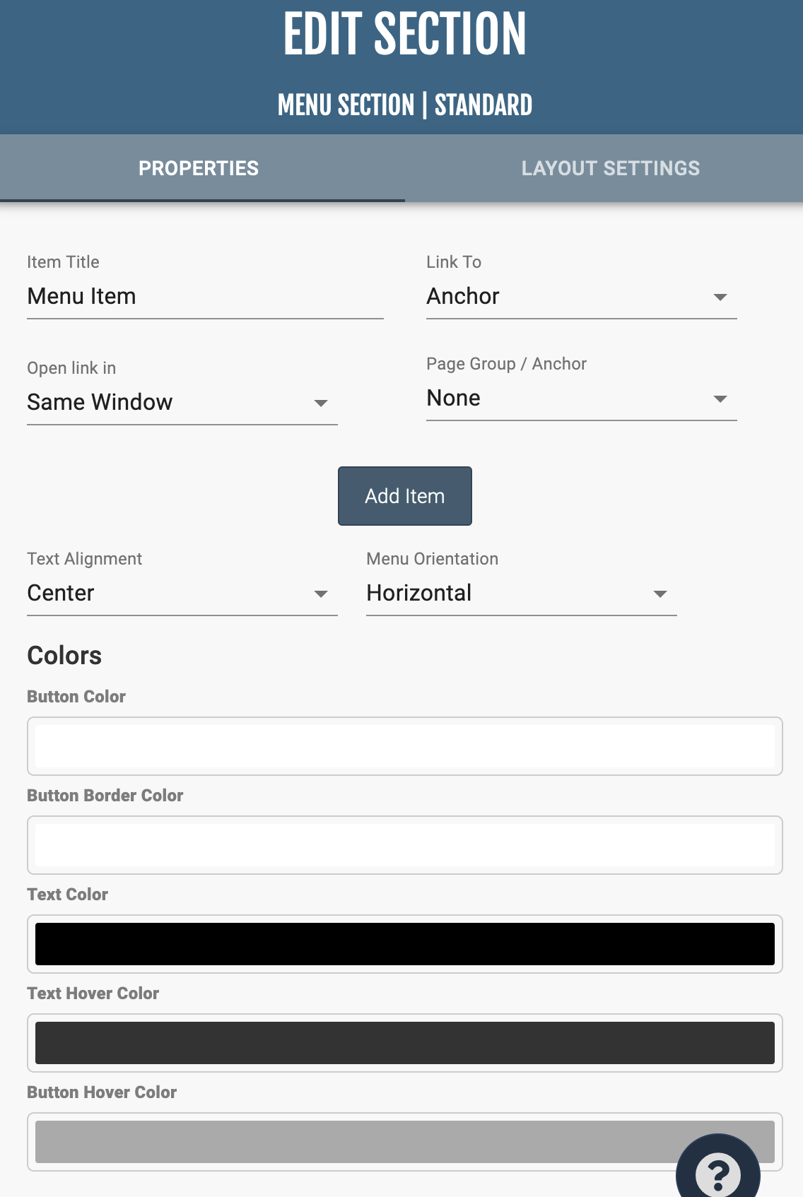
In “Section Properties,” you can modify menu titles, where each menu links to (an existing page, blog, external link, etc), the alignment of the items, and the colors of the buttons. The sliders at the bottom of the menu control the margins of the menu items and the font of the text.
Adding this section will add the “PayPal Cart Group” of your choosing to your page. If you haven’t created a Paypal Group yet, you can do so under Administration > PayPal Store.
A PayPal Group is a group of products that you want to sell.
Once you have added the group to the page, you can click “Section Properties” to modify how it functions. The following properties are available:
PayPal Group - This selects the group you’d like to add.
PayPal Business Email - This is the email address that you use to login to PayPal, into the account that you want to link with.
Show Item Images - This shows or hides the item images from this group.
Show Item Descriptions - This shows or hides the item descriptions from this group.
Show View Cart Button - This shows or hides the “View Cart” button. If clicked, the user will be taken to PayPal to view their cart.
Allow Customer Notes - This allows the customer to fill in notes during checkout with any special instructions.
Purchase Type - Either “Cart” or “Buy Now.” This modifies what the buttons will say under the items.
Download Public Certificate for PayPal/Generate New Private Key and Public Certificate - If you want to use encrypted PayPal buttons, you can follow the instructions here to set them up, and use the download and generate buttons provided here as required through the process. To disable this and use non-encrypted buttons, click the “disable PayPal encryption.” The enryption here prevents someone from coding a button that would attempt to purchase one of your products at a reduced price. While it is a rare occurrence that something like this would happen, the encrypted buttons should prevent it.
Adding this section will add the “PayPal Cart Item” of your choosing to your page. If you haven’t created a Paypal Item yet, you can do so under Administration > PayPal Store.
A PayPal Item is a single product that you want to sell.
Once you have added the item to the page, you can click “Section Properties” to modify how it functions. The following properties are available:
PayPal Item - This selects the item you’d like to add.
PayPal Business Email - This is the email address that you use to login to PayPal, into the account that you want to link with.
Show Item Images - This shows or hides the item image from this item.
Show Item Descriptions - This shows or hides the item descriptions from this item.
Show View Cart Button - This shows or hides the “View Cart” button. If clicked, the user will be taken to PayPal to view their cart.
Allow Customer Notes - This allows the customer to fill in notes during checkout with any special instructions.
Purchase Type - Either “Cart” or “Buy Now.” This modifies what the buttons will say under the items.
Download Public Certificate for PayPal/Generate New Private Key and Public Certificate - If you want to use encrypted PayPal buttons, you can follow the instructions here to set them up, and use the download and generate buttons provided here as required through the process. To disable this and use non-encrypted buttons, click the “disable PayPal encryption.” The enryption here prevents someone from coding a button that would attempt to purchase one of your products at a reduced price. While it is a rare occurrence that something like this would happen, the encrypted buttons should prevent it.
This section displays a PDF in book format with tunable pages.
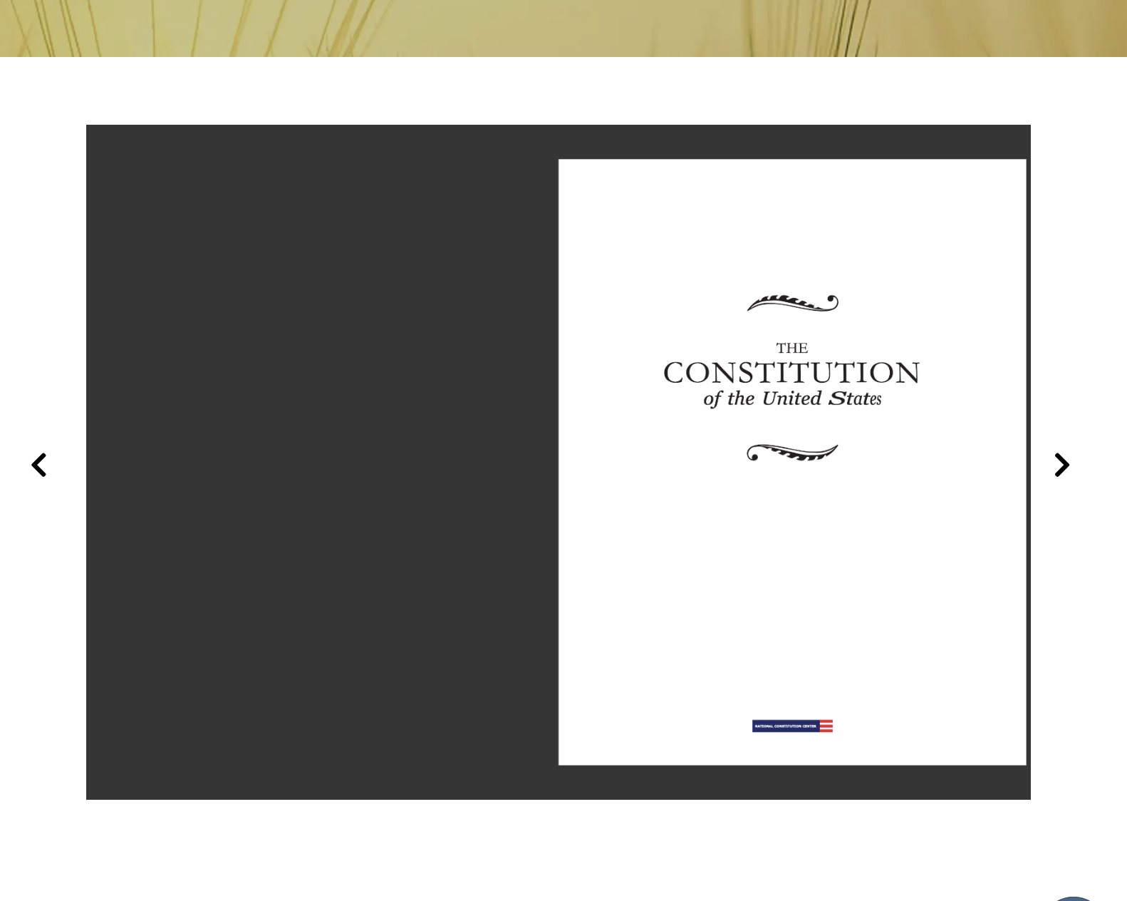
In “Section Properties” you can exchange which file is displayed.
Add a collection of pictures to your website, similar to using a Media Library for videos and files.
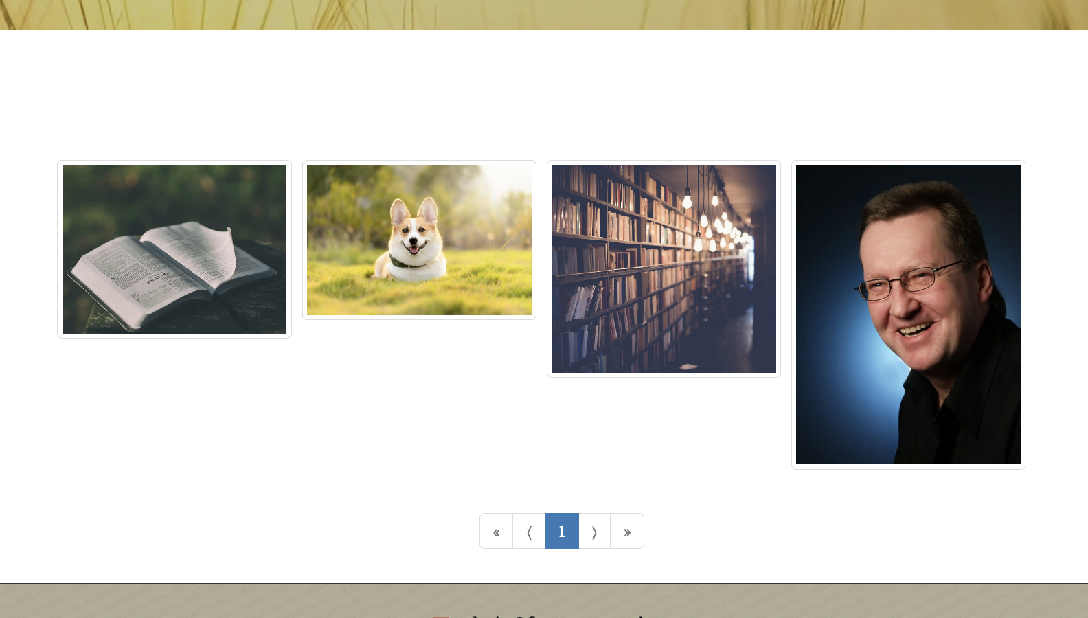
Choose either an exisiting gallery or create a new one. You can add new pictures by clicking “Add Photos” or going into the Edit Gallery menu (the picture icon in the top right), and adding photos either from your local device or that already exist on the website (server).
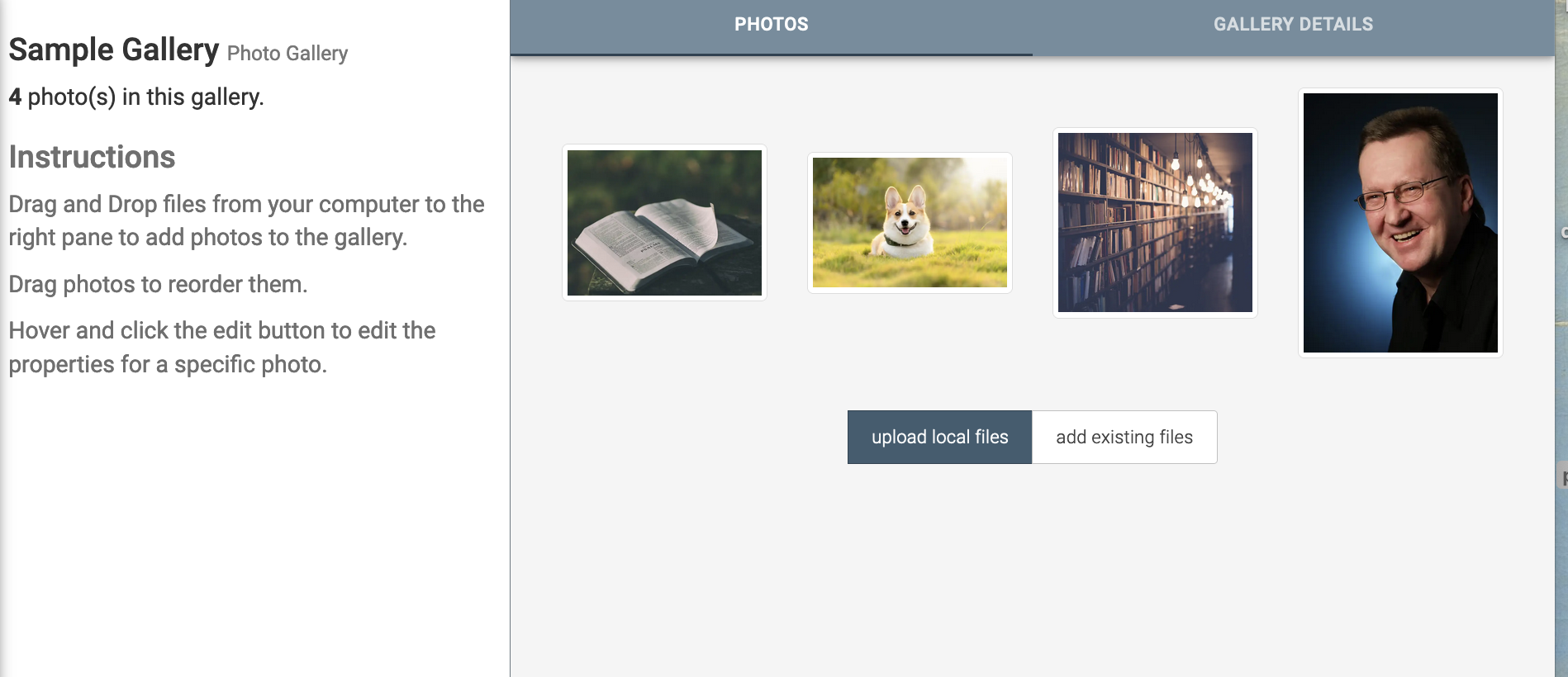
In the Edit Gallery menu, you can click and drag images to arrange them. If you hover an image, you can click the pencil icon to edit the image or the red X to delete it. On the left side of the screen, you can manage categories, tags, and series that the photo can be searched by. As well, you can here download the photo or get a shareable link for others to download the file. On the right side of the screen, you can manage, the File title, subtitle, description, date, author, file visibility, and other information about the file. Make sure you click save after editing a picture!
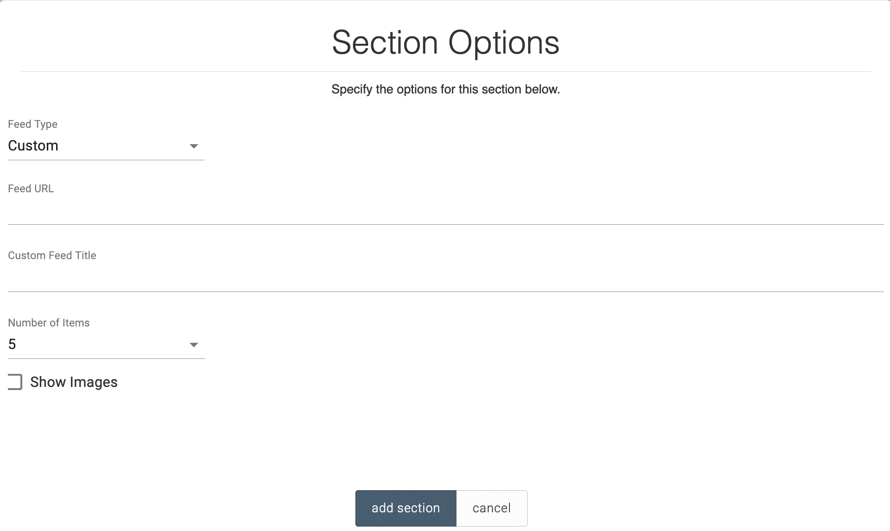
If you have content on other platforms that offer RSS feeds, you can display it using an RSS Feed section. Insert the corresponding RSS feed, provide an optional custom feed title, and select how many items you would like displayed.
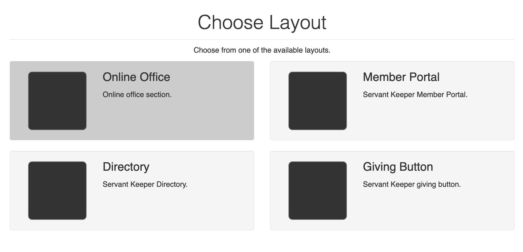
There are four Servant Keeper buttons that link to key features of your Servant Keeper account: the Online Office, Member Portal, Director, and Giving Button.
Upon clicking on any of these options, you will be prompted to insert your Servant Keeper Web ID. You can find this at the end of your giving form link, e.g. giving.servantkeeper.com/firstfriendlychurch. Aftering inserting your Web ID, a button will be placed on your site that will link directly to the selected Servant Keeper feature.

This places a button on the website that shares a link of the present page via email.
This section places a link to a single file on a webpage.
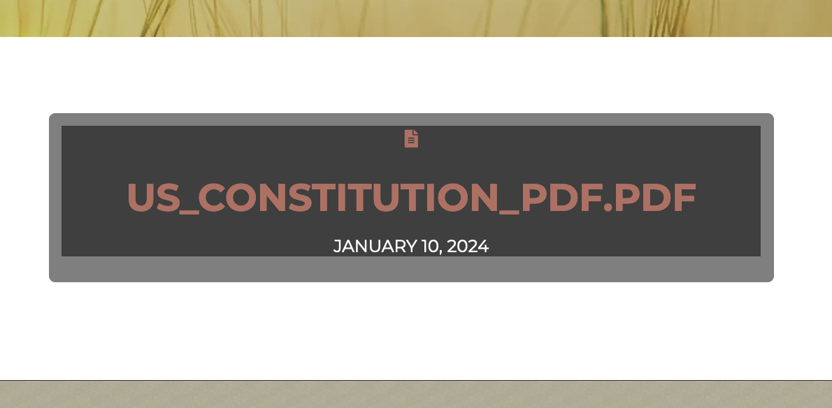
When clicked, it opens a preview to the file on a new page. On the preview page, there is an option to download the file and to share it on social media. On the far left hand side in the edit menu, there is an Edit File button in which you can edit the file information. On the left side of the screen, you can manage categories, tags, and series that the file can be searched by. As well, you can here download the file or get a shareable link for others to download the file. On the right side of the screen, you can manage, the File title, subtitle, description, date, author, file visibility, and other information about the file. Make sure you click save after editing a file!
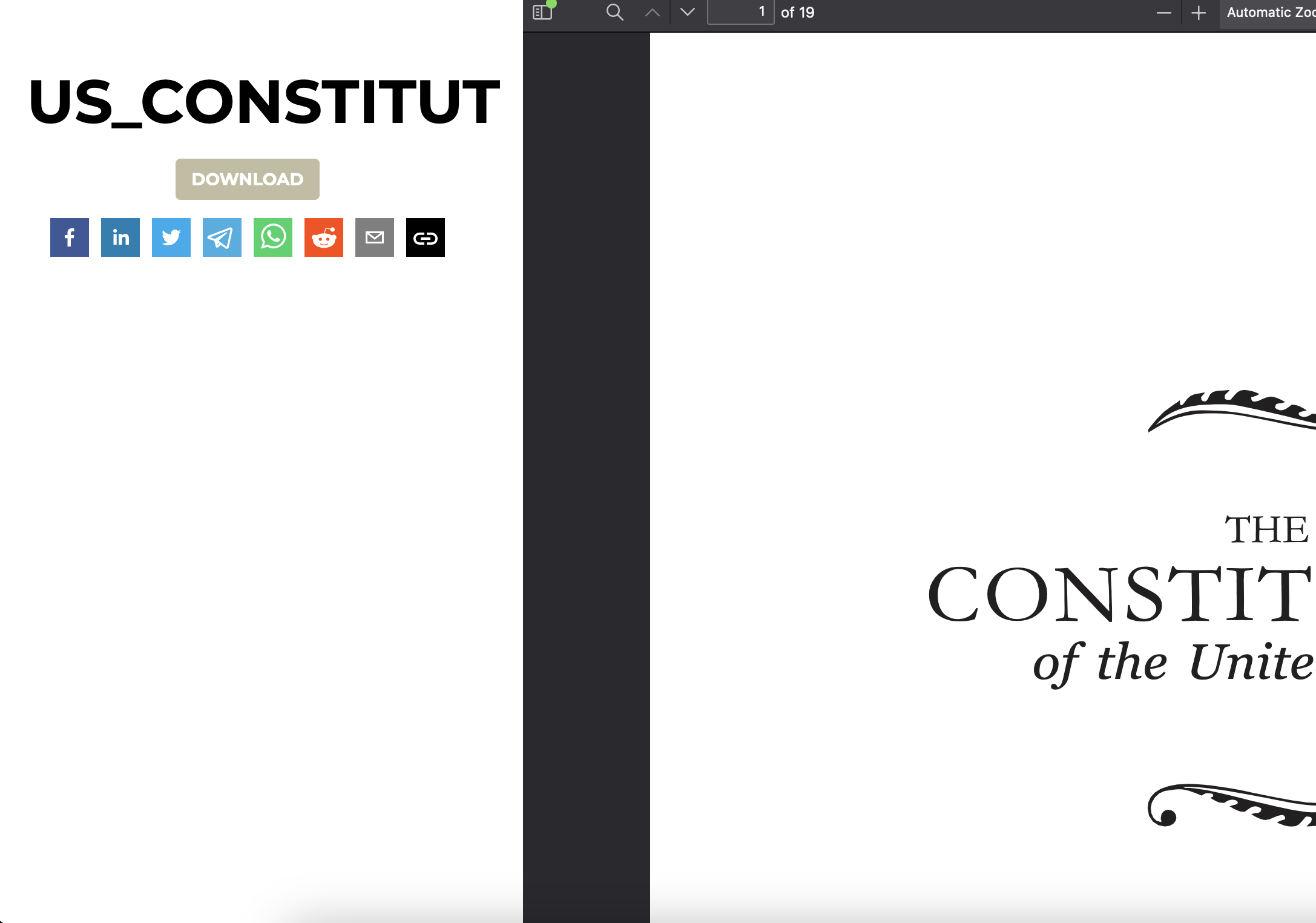
This section adds a variety of social media icons that when clicked, share the present page to those social media platforms.
After clicking “Section Properties,” you can add a Title, URL, description, and Hash Tags that will be sent to the selected social media platform to create the post. At the bottom of the Section Properties, you can disable unused social media icons.
This section displays multiple pages of information across horizontal tabs. You can edit the text of each tab page like any text section.
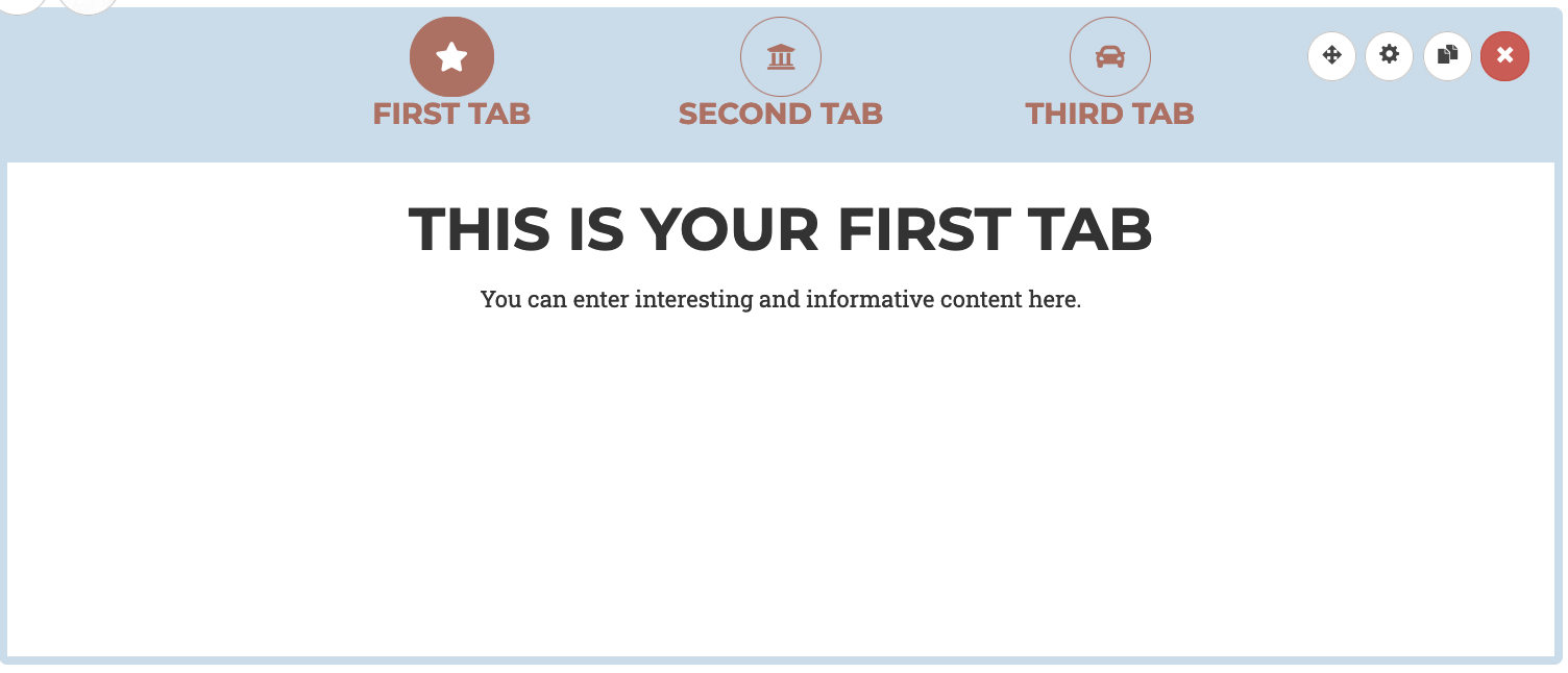
You can change the tab titles and icons, overlay color and opacity, and button style in “Section Properties.” Similar to the Tiles section, you can add more tabs and arrange tabs at the bottom of the editor.
This section displays a grid of image tiles with optional text, that can link to another page, site, external link, etc.
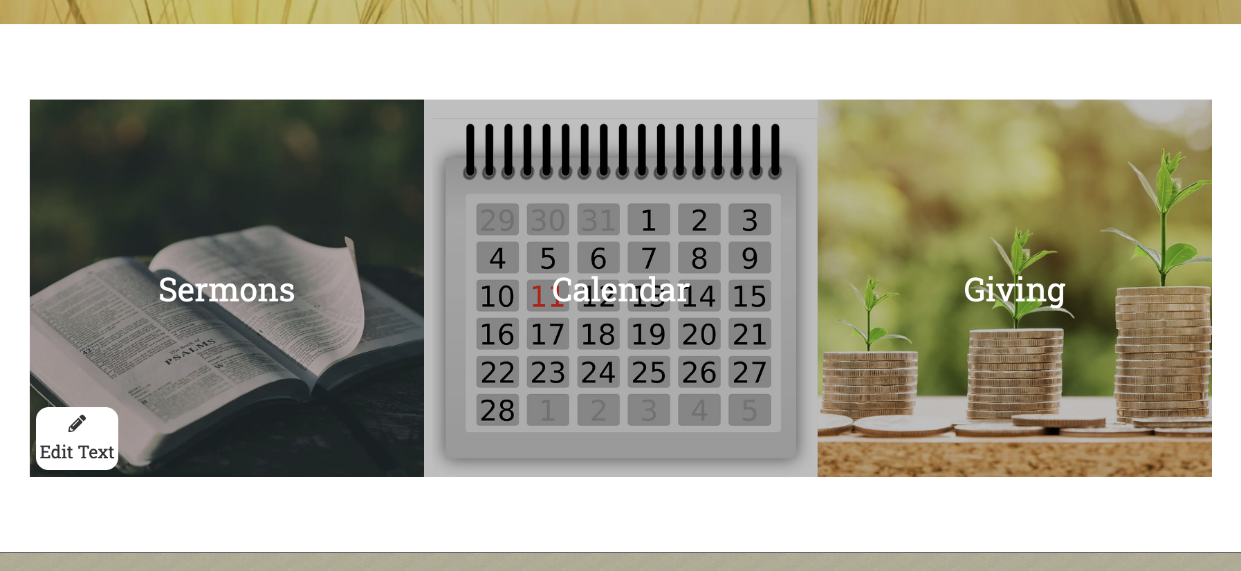
To edit the text on the tiles, first click the “Edit Text” button on the bottom left hand side. Edit the text as desired and when finished, save changes and then click “Stop Editing Text” in the bottom right corner.
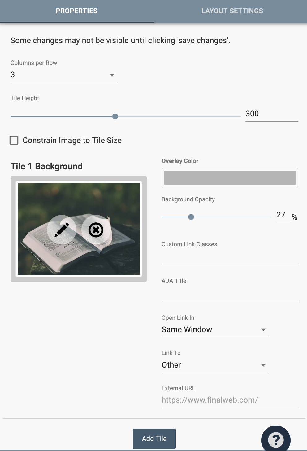
To edit the tiles, click the “Section Properties” gear icon in the top right corner of the section. At the top are options to adjust how many tile rows are shown, the height of the tiles, and how the image relates to the tile size. Tiles can be added and arranged at the bottom of the editor.
There are a variety of settings for each tile, including the image, overlay color, and where the tile links to. The ADA Title is a title for the image so that people with sight disabilities can know what the image is.
In the Layout Settings, you can modify the shadows surrounding the text on the image, the spacing between the tiles (padding), and any animations for the tiles.
The Upcoming Events Section provides a list of the next events on one or more of your Google calendars
Adding an Upcoming Events Section
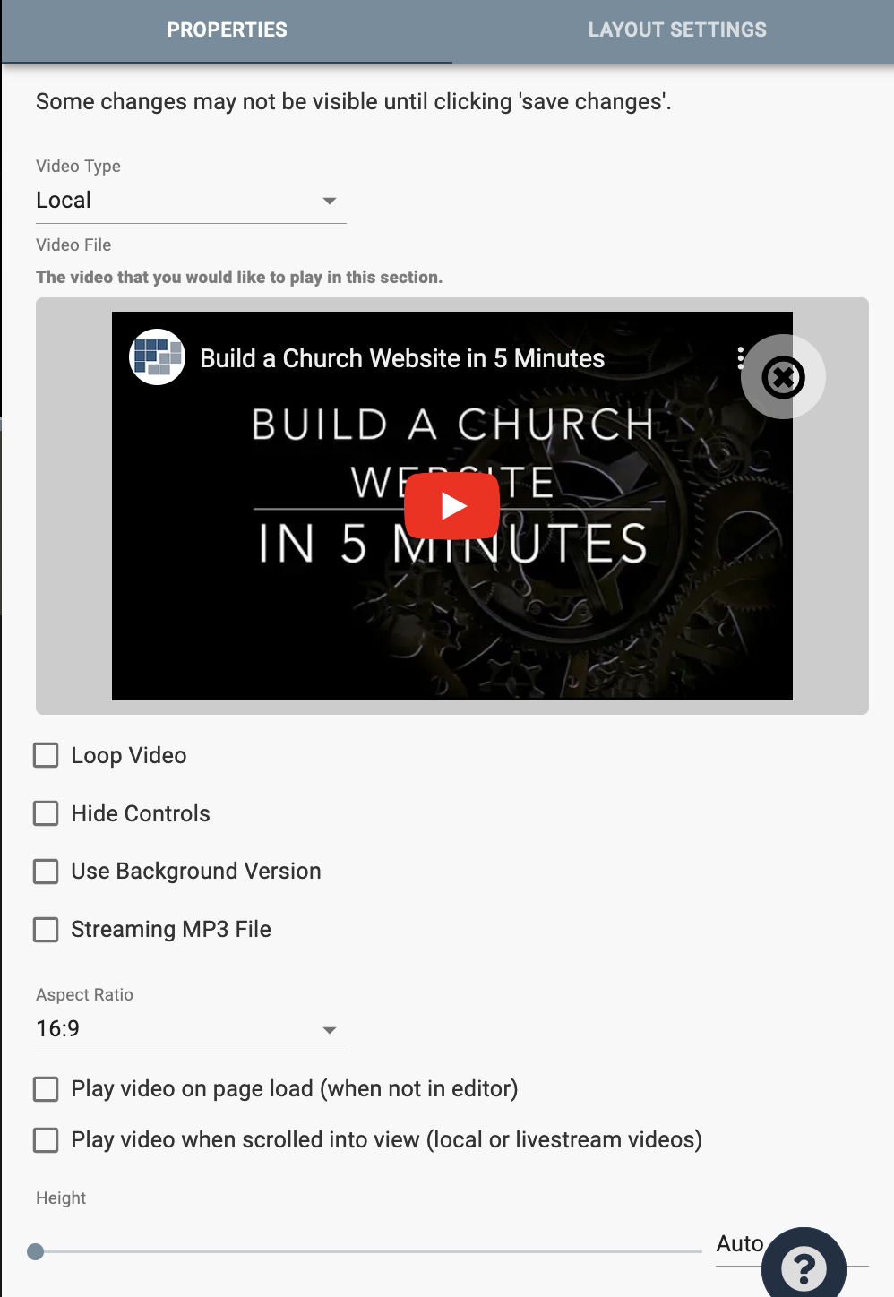
Place a singular video onto a webpage. Under the Video Type dropdown, you can select a video locally from your device, from YouTube, Vimeo, Rumble, or a Remote file. If you use our livestream service, you can sync the Video section to display a particular livestream.
The “Section Properties” gear icon adds two additional settings for whether the video begins playing once the page is loaded or when it is scrolled into view.
